
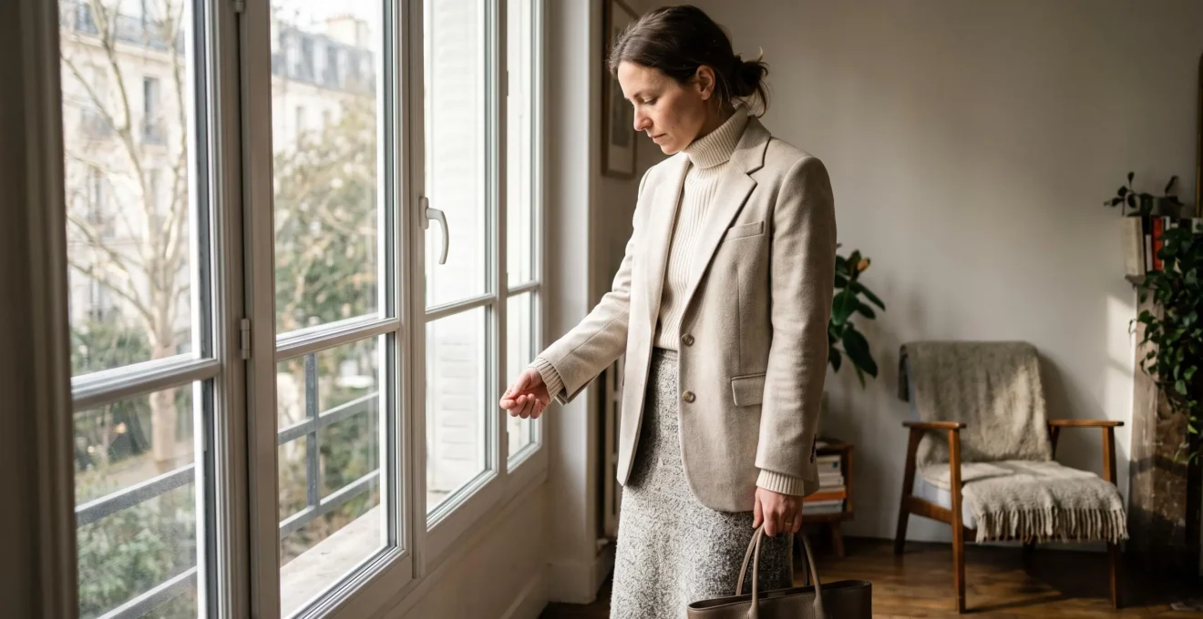
A cream sweater, beige trousers and a grey coat should make an effortlessly elegant outfit. Yet sometimes, the result looks surprisingly flat. The problem may have nothing to do with the colours or the individual garments. It may be that every fabric has a similar surface, reflects light in the same way and creates almost no visual separation.
Textural contrast adds depth to neutral outfits by combining fabrics with different finishes, structures and tactile qualities. A ribbed knit against smooth tailoring, brushed wool beside polished leather, or matte cotton beneath satin introduces visual interest without adding a single bright colour.
The idea is not to make an outfit literally twice as attractive. There is no established measurement supporting that multiplier. Instead, texture provides another styling tool when colour contrast is intentionally restrained.
Understanding which fabrics work together, where to position them and how they behave throughout the day makes neutral dressing more deliberate. The most convincing combinations often rely on just three distinct surfaces, carefully balanced rather than competing for attention.
Neutral outfit texture: the essentials
- Combine surfaces that reflect light differently, such as matte wool, ribbed cotton and softly polished leather.
- Use one dominant texture, one quieter supporting texture and one small accent instead of giving every fabric equal attention.
- Consider lighting, fabric condition, seasonal comfort and garment structure before adding more layers.
- Why Do Neutral Outfits Look Boring Until You Add Texture?
- How to Mix 3 Textures in One Outfit Without Looking Messy?
- Matte or Shiny Textures: Which Looks Better for a Dinner Reservation at 7 pm?
- The Texture Mistake That Can Make Even Good Clothes Look Cheap
- When Should You Switch Textures for Autumn So Your Outfits Don’t Feel Flat?
- Why Does Your Cotton T-Shirt Look Wrinkly and Cheap After 2 Hours?
- How to Wear Coarse Wool Using 2 Simple Layering Tricks Without Looking Bulky?
- How Do You Wear Coarse Wool Without Itching All Day?
Why Do Neutral Outfits Look Boring Until You Add Texture?
Neutral outfits can look visually flat when their fabrics have similar finishes, weights and surface structures. Without strong colour differences, the eye relies more heavily on texture, silhouette and light to distinguish garments. Combining smooth, ribbed, brushed or granular materials helps define each layer and creates interest while preserving a restrained colour palette.
Imagine a beige cotton T-shirt worn with beige jersey trousers and a soft beige cardigan. Even if the shades differ slightly, the three surfaces may blend together. Their similar softness and relatively uniform finishes make it difficult to distinguish where one garment ends and another begins.
Replace the cardigan with a structured tweed jacket and the relationship changes. Tiny irregularities in the woven surface catch light differently from the cotton beneath. Add a smooth leather belt and another distinct visual plane appears.
The mechanism is straightforward: fabric texture changes the way light interacts with clothing. A matte surface produces relatively subdued highlights, while a lustrous surface can reflect light more prominently. Raised yarns, ribs and loops create small variations in light and shadow.
This relationship is consistent with Utah State University Extension‘s overview of clothing and textile design elements, which explains that fibre content, yarn characteristics, construction and finishing influence textile texture. These properties affect both the visual appearance and perceived shape of garments.
Two distinct problems can make a neutral outfit seem monotonous. The first is insufficient contrast in light reflection: everything appears equally matte or equally glossy. The second is insufficient visible surface variation: several fabrics might feel different to the touch yet appear almost identical from a distance.
A practical styling experiment is to photograph the outfit in black and white. If the jacket, top and trousers merge into one continuous area, try replacing one item with a visibly different surface. This is a useful visual exercise, not a scientifically validated test.
Texture is also different from pattern. A printed floral shirt adds decorative detail, but a plain bouclé jacket creates structural relief. Smooth poplin and smooth jersey may appear similar in a photograph, whereas pronounced corduroy ribs or grainy leather remain visually distinct even in one colour.
Beige, charcoal, cream and taupe do not inherently make outfits boring. Their simplicity simply gives fabric construction a more prominent visual role.
Once that distinction becomes familiar, the challenge changes from finding interesting fabrics to combining them without overwhelming the silhouette.
How to Mix 3 Textures in One Outfit Without Looking Messy?
To mix three textures successfully, assign each fabric a different visual role: one dominant texture, one supporting texture and one small accent. Keep the colours relatively close, vary the amount of surface detail and avoid combining three equally dramatic materials. The goal is a clear visual hierarchy, not maximum fabric variety.
A reliable combination starts with a piece that attracts attention through its surface. This could be a bouclé jacket, heavily ribbed cardigan or brushed wool coat. Because that texture already contributes significant detail, the second fabric should be quieter.
For example, pair a cream bouclé jacket with smooth stone-coloured trousers. Add a dark taupe grained leather bag as the third element. The eye first notices the jacket, then the uninterrupted line of the trousers, then the accessory.
The same principle can work in reverse: choose smooth tailored clothing as the dominant visual area, introduce a chunky knit as the secondary element and finish with polished leather shoes.
For consistency, think about three degrees of surface variation:
- Strong: pronounced bouclé, chunky cable knitting, coarse tweed or deep corduroy.
- Moderate: fine ribbing, suede, lightly brushed wool or textured crepe.
- Subtle: smooth cotton, compact wool tailoring or restrained leather finishes.
Combining three subtle surfaces may create too little visible contrast. Combining three highly expressive textures can produce a visually busy outfit. A strong, moderate and subtle combination is usually easier to balance, although the exact result depends on garment proportions.
Colour also changes how much variation the outfit can accommodate. A head-to-toe oatmeal ensemble often tolerates pronounced differences between boucle, ribbed knit and leather because colour remains a unifying element. Introducing three unrelated colours alongside three assertive textures requires more careful coordination.
The greatest styling mistake is dividing the outfit into three equally attention-grabbing sections. Instead, let one material occupy the main visual area, another provide continuity and the third appear in a smaller accessory or detail.
Five checks for a balanced three-texture outfit
- Lay out three garments or accessories in neighbouring neutral shades. The result is a three-piece outfit selection.
- Identify the strongest surface and designate it as the dominant texture. The result is one clear focal piece.
- Replace any equally busy second piece with a smoother material. The result is a visible hierarchy.
- Add a smaller contrasting finish through a bag, belt or shoes. The result is a distinct accent area.
- Photograph the finished outfit from a few steps away and identify which texture attracts attention first. The result is a reference photograph for future combinations.
Three textures are not an obligation. Two can be enough when the contrast is clear, particularly for evening looks where lighting introduces an additional consideration.
Matte or Shiny Textures: Which Looks Better for a Dinner Reservation at 7 pm?
For an evening dinner, matte fabrics usually provide a discreet, structured foundation, while a restrained glossy element can introduce a more dressed-up finish. The best choice depends on restaurant lighting, formality and where you want the eye to settle. A matte outfit with one softly lustrous accent is a versatile starting point for an uncertain dress code.
At 7 pm, a restaurant might be filled with daylight, warm pendant lighting or relatively dim ambient light. These settings affect how prominently a reflective fabric appears. A satin skirt may catch individual highlights beneath a lamp, while wool tailoring remains visually quieter.
The important question is not simply whether shine is elegant. It is how much shine the outfit needs.
A useful approach is to place a single lustrous surface near the area you want to emphasize. A silk blouse draws attention toward the face and upper body. Polished shoes create a subtler highlight near the ground. A satin skirt becomes the central feature of an otherwise understated ensemble.
Consider these combinations:
| Setting | Matte foundation | Optional lustrous accent |
|---|---|---|
| Relaxed neighbourhood restaurant | Fine wool trousers and cotton knitwear | Polished leather loafers |
| Smart-casual dinner | Structured blazer and crepe trousers | Washed-silk blouse or softly reflective bag |
| Formal evening restaurant | Refined wool jacket or tailored separates | Satin skirt or lustrous silk top |
Not all shine is created in the same way. CottonWorks‘ technical explanation of basic woven fabric designs describes how satin’s weave structure, including relatively long yarn floats, produces a smooth and lustrous surface. This structural characteristic helps explain its reflective appearance, but sheen alone does not establish fabric quality or price.
Before buying a glossy garment, observe how its surface behaves under both window light and an indoor lamp. Look for the quality of its drape, the consistency of its finish and whether highlights flatter the garment’s construction. A pronounced plastic-like reflection is not automatically evidence of poor quality, just as subdued silk is not automatically superior.
For an ambiguous invitation, a matte wool blazer, well-cut crepe trousers and a softly lustrous silk accessory offer a controlled degree of formality.
Even the most carefully balanced combination can lose its intended effect when the fabrics appear worn, distorted or poorly maintained.
The Texture Mistake That Can Make Even Good Clothes Look Cheap
One common mistake is combining several smooth, lightweight garments whose surfaces have deteriorated differently. Pilling knitwear, a stretched jersey top and badly creased trousers can make an otherwise coordinated outfit appear less polished. The issue is not necessarily garment price but the contrast between the intended clean silhouette and the actual condition of the fabrics.
A luxury label cannot prevent every material from developing wear. Similarly, affordable clothing can look refined when its fabric maintains a clear shape, consistent surface and appropriate drape.
Think of a fine beige sweater worn over a soft white T-shirt with lightweight cream trousers. If the sweater has developed pills, the T-shirt has twisted at the seams and the trousers crease heavily around the waist, all three pieces compete through unwanted irregularities.
Unlike the deliberate relief of tweed or bouclé, these irregularities may distract from the silhouette rather than clarify it.
The distinction matters because pilling has several possible causes. CottonWorks’ technical resource on garment durability explains that fibre characteristics, yarn construction, fabric construction, finishing and use can influence the formation of small entangled fibre balls on a textile surface.
Pilling therefore should not automatically be attributed to careless washing or inexpensive materials.
Good fabric condition is part of successful textural contrast. A well-maintained tweed jacket offers intentional relief, whereas a stretched and pilling jersey surface introduces accidental texture.
When shopping, examine how a garment behaves rather than relying exclusively on its composition label. Gently compress a small fabric section where appropriate and check how it recovers. Examine seam alignment, surface consistency and whether the garment returns to its intended shape after light handling.
A brief folding test can reveal an immediate tendency to crease, but it cannot reliably predict every garment’s condition after hours of movement, sitting and wear.
For existing clothing, maintenance should match the fabric:
- Remove pills carefully with a suitable fabric comb or fabric shaver, testing an inconspicuous area first.
- Use steaming only when compatible with the garment’s care instructions.
- Dry susceptible knitwear flat when recommended to reduce stretching.
- Store garments clean and fully dry to avoid persistent storage odours and unwanted creasing.
A single structured material can also improve the perceived coherence of simpler clothing. For example, a crisp gabardine jacket may lend definition to a basic cotton top and understated trousers without requiring the entire outfit to consist of expensive garments.
Preserving the existing textures is often more effective than purchasing another statement item, particularly as seasonal layering changes how every fabric is seen.
When Should You Switch Textures for Autumn So Your Outfits Don’t Feel Flat?
Start introducing autumn textures when cooler conditions call for additional layers and your lightweight summer fabrics no longer provide the visual depth you want. There is no universal changeover date. Adding tweed, corduroy, brushed wool or grained leather gradually allows neutral outfits to adapt to lower temperatures and changing light without replacing the entire wardrobe.
Summer neutral dressing often relies on breathable linen, lightweight cotton poplin and fluid fabrics. These materials can look particularly effective in bright conditions, where gentle folds, crisp edges and moving fabric create their own visual interest.
As the season changes, the balance of an outfit often changes too. Coats, cardigans and scarves cover larger portions of the silhouette, so their surfaces become more influential than the T-shirt or shirt underneath.
Low-angle sunlight can also reveal raised fabric details through small highlights and shadows. Corduroy ribs, tweed irregularities and bouclé loops may become especially visible in directional light. This is a lighting effect rather than evidence that summer fabrics automatically lose their appeal in autumn.
For an easy transition, keep your summer base but change the outer layer. A fine cream cotton T-shirt beneath a structured beige tweed gilet creates a stronger surface contrast without adding unnecessary warmth from multiple thick knits.
Accessories provide another practical entry point. A grained leather crossbody bag, wool scarf or corduroy cap introduces seasonal texture while allowing the main clothing layers to remain light enough for unpredictable temperatures.
For a more substantial change, consider replacing the most visible smooth surface first. A softly structured wool coat can have greater impact on an autumn outfit than replacing several barely visible inner layers.
The best seasonal transition is therefore based on temperature, visible garment area and light, not the month printed on a calendar. Mild coastal climates may call for very different layering decisions from colder inland regions.
Texture does not have to mean heavy fabric either. Fine-wale corduroy, lightweight wool crepe and moderately textured cotton offer alternatives when thick outerwear would be uncomfortable.
Whichever outer layer you introduce, the quality and fit of the cotton basics underneath still affect how polished the complete outfit appears.
Why Does Your Cotton T-Shirt Look Wrinkly and Cheap After 2 Hours?
A cotton T-shirt may develop visible wrinkles after a short period because of its fabric construction, finishing, fit and repeated movement. Cotton fibre characteristics can influence performance, but fibre length alone does not determine whether a garment creases. Thin or unstable jersey, tight areas and prolonged compression can all contribute to an untidy appearance.
The first distinction is between ordinary wear creases and a more persistent loss of garment shape.
Creases near the waist often arise from sitting, tucking and repeated bending. Lines around the underarms can reflect arm movement or a close-fitting cut. These are not necessarily indications of poor manufacturing.
However, a T-shirt that twists around the torso, loses its hemline shape or remains heavily distorted after normal movement may have additional construction or fit problems.
Long-staple cotton varieties, including cotton marketed as Supima or Egyptian cotton, can support the production of smooth, strong yarns. Their presence alone does not guarantee wrinkle resistance, because yarn twist, knitting structure, finishing and garment construction also matter.
Similarly, a heavier jersey may feel more substantial and drape differently, but fabric weight is not a universal measure of quality or crease resistance. Some lightweight jerseys are well engineered, while substantial fabrics can still wrinkle visibly.
Before buying a neutral T-shirt, perform three simple observations:
- Feel the fabric weight and drape. Check whether the garment has the appearance and coverage required for your intended outfit.
- Gently stretch an unobtrusive section and observe its recovery. Notice whether the fabric returns close to its original shape without distortion.
- Compress a small section briefly and release it. Observe the immediate crease response without treating the result as a guarantee of all-day performance.
Fit is equally important. A T-shirt that is too tight may experience increased tension across the chest and waist. A very loose garment can gather into repeated folds under a fitted jacket.
When the T-shirt serves as the smooth foundation beneath a textured blazer, its condition becomes particularly noticeable. The deliberate contrast works best when the base remains relatively clean and stable throughout wear.
For an existing garment, consider adjusting how it is tucked, choosing a different fit or caring for it according to its label before replacing it. The right solution depends on whether the problem is local creasing, poor shape recovery or ordinary fabric movement.
A smoother, better-fitting base is also useful when introducing coarse wool, because it provides both visual calm and a practical starting point for comfortable layering.
How to Wear Coarse Wool Using 2 Simple Layering Tricks Without Looking Bulky?
Coarse wool can be worn without excessive visual bulk by keeping the inner layers thin and allowing the textured wool to form the outermost visible layer. Alternatively, confine coarse texture to a smaller accessory or accent garment. Both approaches preserve visual contrast while avoiding unnecessary accumulation of thick fabric around the body.
The first technique is a gradual increase in layer thickness from the body outward. Start with a fine cotton or similarly smooth base, add a thin knit only if warmth is required, then finish with a coarse wool jacket or cardigan.
This makes practical sense because bulky knitwear is less likely to compress comfortably beneath another closely fitted garment. Thin inner layers also allow a structured outer piece to follow its intended cut.
For example, combine a fitted cream cotton top, a fine-gauge grey cardigan and a straight-cut oatmeal tweed jacket. The jacket provides the dominant visible texture, while the quieter pieces underneath contribute warmth without creating competing areas of heavy relief.
The second technique is to use coarse wool as a limited accent. A rustic wool scarf, bouclé cap or tweed waistcoat introduces a pronounced surface without covering the entire silhouette.
Consider a charcoal tailored coat worn over smooth knitwear. Adding one coarse wool scarf around the neckline introduces enough tactile contrast to distinguish the outfit from a completely smooth ensemble.
Coarse texture and physical volume are related but not interchangeable. A fabric can have a rough surface while remaining relatively compact. Conversely, an exceptionally fluffy knit may add considerable bulk even if it feels soft.
Cut, thickness, stiffness and garment proportions ultimately determine the apparent silhouette. A straight, moderately weighted tweed jacket may look more structured than two loose, soft cardigans layered together.
It would be misleading to assume that coarse wool always makes a particular area look smaller because it absorbs light. Some pronounced textures can increase apparent volume, especially when the garment is thick, loosely shaped or heavily raised.
For a balanced appearance, compare the complete outfit from the front and side. Check that shoulder seams sit where intended, sleeves move freely and the outer garment does not pull over its inner layers.
Once the overall silhouette feels balanced, the remaining issue is whether the fibre itself will be comfortable against the skin for an entire day.
Key takeaways before wearing coarse wool
- A visually textured wool garment is not necessarily thick, but construction and cut determine how much volume it adds.
- Thin, smooth inner layers can improve the fit of an outer wool garment while creating an additional comfort barrier.
- Fibre fineness and individual sensitivity matter more than a garment’s price when assessing next-to-skin softness.
How Do You Wear Coarse Wool Without Itching All Day?
To wear coarse wool comfortably, prevent the roughest fibres from rubbing directly against sensitive skin. A thin, smooth underlayer can create a protective barrier, while finer wool may be more comfortable for garments intended for direct contact. Fibre diameter, fabric construction and individual sensitivity all influence whether a wool garment feels prickly.
The familiar itchy sensation associated with some wool is often mechanical. Relatively thick, stiff fibre ends can press against the skin without bending as readily as finer fibres. This can produce prickling even when the garment is clean and well made.
Price is therefore an unreliable guide to comfort. A costly rustic tweed can feel rougher than a less expensive fine-gauge wool garment, depending on the fibres and construction.
The Woolmark Company‘s explanation of wool fibre properties describes the relationship between fibre diameter and softness. Finer Merino wool fibres bend more readily against the skin, which helps explain why fine Merino is often selected for next-to-skin clothing.
The material is not universally comfortable for everyone, however. Fabric finishing, individual skin sensitivity and garment fit can also influence the experience.
A practical first solution is a continuous, smooth barrier layer. Choose a fine cotton T-shirt, lightweight silk top or smooth modal garment, depending on fit and personal preference.
Make sure the underlayer covers contact points such as the neck, wrists and torso. A perfectly smooth T-shirt offers limited protection if the coarse wool collar still rubs directly against the neck.
For a neutral outfit, the barrier does not need to disrupt the styling. A fine cream base beneath an oatmeal wool cardigan can disappear visually into the palette, allowing the outer texture to remain the focal point.
When comparing wool garments in a shop, gently place the fabric against the inner wrist or near the neck for a brief comfort check. These areas may reveal prickliness that is less noticeable when the fabric is handled only with the fingers. This informal test cannot predict every person’s response after prolonged wear.
Fine Merino may offer a softer next-to-skin option, while certain alpaca garments can also feel comfortable depending on fibre characteristics and processing. Neither fibre name guarantees the absence of irritation.
Care deserves attention as well. Follow the manufacturer’s washing and drying instructions to avoid damaging fibres or changing the fabric’s structure. Some wool becomes more pleasant to handle over time, but washing cannot reliably transform inherently coarse fibres into fine ones.
Fabric softener should not be treated as a guaranteed remedy. Use only care products specifically compatible with the garment when its instructions permit them.
If a wool garment repeatedly causes significant irritation even with a protective layer, choose another fabric or construction rather than enduring discomfort. Persistent rashes or unusual reactions deserve medical assessment rather than being assumed to be ordinary wool prickling.
Try one outfit already in your wardrobe: begin with a smooth neutral base, introduce a comfortable textured wool layer and finish with a restrained leather or silk accent. Check the silhouette, fabric contrast and comfort before adding anything else.
Can an all-black outfit benefit from textural contrast?
Yes. All-black dressing can rely on contrasts between matte wool, ribbed knitwear, leather and satin to make individual garments more distinct. Because the colours are similar, surface structure, finish and lighting become important ways to create separation. A matte black blazer with a softly lustrous black top is a straightforward example.
Do neutral outfits need expensive natural fabrics to look sophisticated?
No. Fabric price and natural fibre content do not automatically determine how polished an outfit appears. Fit, drape, surface condition and compatibility between textures are more useful styling considerations. A well-maintained cotton top and structured, moderately priced jacket can create effective contrast without luxury materials.
Can you combine different shades of beige without looking mismatched?
Yes. Cream, sand, oatmeal and taupe can work together when their undertones and surface finishes feel coordinated. Rather than matching every shade precisely, use different textures to distinguish the pieces intentionally. For instance, combine a cream ribbed knit, sand-coloured tailored trousers and a taupe leather accessory.
Is suede or smooth leather better for adding texture to a minimalist outfit?
Suede usually introduces a soft, matte, slightly napped surface, while smooth leather offers a more continuous finish that may reflect light more prominently. Choose suede when the outfit already contains smooth, polished materials. Choose smooth leather when the surrounding fabrics are predominantly fuzzy, ribbed or granular. Maintenance requirements and weather suitability should also influence the decision.
How can you make a neutral summer outfit interesting without heavy layering?
Use contrasts between lightweight surfaces rather than adding thickness. A textured linen shirt, smooth cotton trousers and a grained leather belt can introduce visible variation while keeping the outfit relatively breathable. Details such as ribbed hems, woven accessories and subtle fabric sheen can also provide contrast without an extra clothing layer.