
Getting dressed becomes unnecessarily complicated when every morning starts with the same question: which colours actually work together? A wardrobe can contain plenty of clothes yet offer surprisingly few combinations that feel right.
The solution is not necessarily fewer clothes, a completely neutral wardrobe or an expensive colour consultation. It is a personal colour palette built around what you already wear: a small group of compatible neutrals, recurring colours and optional accents that makes everyday outfit decisions more predictable.
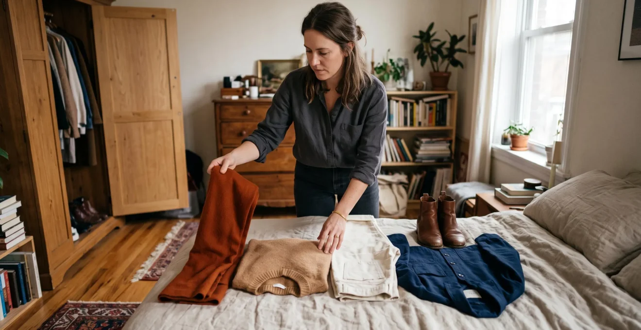
Start with twelve frequently worn items. Look for repeated shades, check how their undertones and lightness levels interact, then choose two base neutrals that connect the largest number of pieces. Save the resulting palette on your phone and use it when planning outfits or considering new purchases.
This approach creates a practical reference rather than a rigid fashion rule. The aim is to spend less time reconsidering combinations while keeping enough variety to enjoy getting dressed.
Your everyday wardrobe colour strategy
- Build your palette from twelve items you actually wear, identifying two useful neutrals and a small group of recurring colours.
- Check undertones, lightness and colour intensity together: matching colour names alone does not guarantee a coordinated outfit.
- Test new colours against existing combinations before buying, and use accessories to experiment without rebuilding your wardrobe.
- Why Does a Wardrobe With Too Many Colours Still Feel Like “Nothing Matches”?
- How to Build a Personal Colour Palette From 12 Items You Already Own?
- Neutral Palette or Colour Palette: Which Is Better If You Repeat Outfits Weekly?
- The Palette Mistake That Makes Your Outfit Look Slightly Wrong in Photos
- When Should You Add an Accent Colour Without Replacing Half Your Wardrobe?
- How to Build a 3-Colour Outfit Using Undertones Without Overthinking?
- How to Choose 2 Base Neutrals That Match 90% of Your Wardrobe?
- How Do You Build a Neutral Colour Palette That Doesn’t Look Flat or Boring?
Why Does a Wardrobe With Too Many Colours Still Feel Like “Nothing Matches”?
A wardrobe with many unrelated colours can feel difficult to coordinate because each garment has fewer obvious partners. The problem is not simply the number of colours: differences in undertone, lightness and intensity can make apparently compatible pieces look disconnected. A useful wardrobe palette reduces those uncertainties by giving everyday combinations a shared visual foundation.
Imagine opening a wardrobe containing olive trousers, cobalt tops, burgundy knitwear, pale pink shirts and several different shades of beige. Each piece may look appealing individually. But when the colours have been purchased independently, finding combinations that feel intentional can take more consideration than expected.
Even colours with the same name can behave differently. A yellow-based beige and a pinkish beige may create an unexpected contrast. Two blues can differ in brightness or depth so much that they compete rather than complement one another.
These distinctions matter because colour coordination involves more than hue. New Mexico State University’s guide to colour explains three important properties: hue, value (lightness or darkness) and intensity (brightness or dullness). It also describes how different colour relationships can create harmony or deliberate contrast.
To identify the problem in your own wardrobe, place your frequently worn pieces together. Then bring out several items you rarely wear and try pairing each one with your usual trousers, tops and outerwear.
- If an unworn item works with several combinations, colour probably is not its main obstacle. Fit, comfort or practicality may matter more.
- If it works with only one garment, it may sit outside your everyday working palette.
- If several supposedly neutral pieces clash, compare their temperature, depth and intensity rather than their colour names.
The distinction is between your total colour inventory and your working palette. You can own many colours while regularly using only a compatible selection of them.
Buying another supposedly versatile garment does not automatically help. A new beige jacket, for example, may add little versatility if its undertone conflicts with the trousers and knitwear already in rotation.
The next step is to discover which colours already work together in your everyday outfits, rather than choosing an entirely new palette from scratch.
How to Build a Personal Colour Palette From 12 Items You Already Own?
Build a personal colour palette by selecting twelve garments you wore most frequently during the past month, photographing them in natural daylight and grouping them by recurring colours. Identify the dominant neutrals, supporting shades and occasional accents, then test their compatibility. The result is a practical palette based on real habits rather than an idealised wardrobe.
The important distinction is between clothes you love in theory and clothes you consistently reach for. A beautiful jacket worn once a year should not outweigh trousers you use three times a week.
Start with twelve items as a manageable sample, not a scientifically established ideal wardrobe size. Include tops, bottoms and layers so the selection reflects complete outfits rather than one clothing category.
- Select your twelve most-worn items. Use recent wear as your main criterion, including everyday work and leisure clothes.
- Photograph them in daylight. Arrange the garments near a window, avoiding strong direct sunlight and heavy colour filters.
- Identify dominant colours. Look for the neutrals and recurring shades occupying the greatest part of your existing outfits.
- Group secondary and tie-in colours. A secondary colour might appear in several tops; a tie-in colour might repeat through shoes, scarves or small details.
- Test combinations. Check which shades work well together in outfits you would actually wear.
For example, a hypothetical twelve-item selection might reveal navy and cream as recurring foundations, muted green as a supporting colour and rust as an occasional accent. That pattern is more useful for shopping than a list of fashionable colours unrelated to the owner’s clothes.
Next, compare the warm and cool characteristics of your groups. If most frequently worn pieces share warm undertones, a noticeably cool-toned garment may require more careful combinations. The reverse also applies.
However, do not automatically remove an item because its temperature differs. Warm and cool colours can be combined deliberately. First check whether that item creates useful contrast or simply struggles to fit into outfits.
Save photographs or digital swatches of your most useful shades in one phone album. While shopping, hold a prospective garment near those references and ask whether it repeats an existing colour, complements the palette or creates a deliberate bridge between two shades. Camera screens and store lighting can distort colours, so confirm promising combinations in person when possible.
This method also provides a practical alternative to beginning with seasonal colour charts and purchasing clothes to satisfy a theoretical classification. Seasonal analysis can offer inspiration, but the palette still needs to reflect what you own, enjoy wearing and need for daily life.
The clothing assessment principles in New Mexico State University’s clothing reuse guide also support starting with an inventory and considering garments’ colour, design, texture and usefulness before changing them.
Your five-step wardrobe palette worksheet
- Choose twelve frequently worn garments and create one photograph showing the complete selection.
- Sort the items into recurring colour groups and save one labelled photograph of the groups.
- Choose two likely base neutrals and record at least three existing outfit combinations using them.
- Identify supporting colours and accents, then save a phone album containing their visual references.
- Write one shopping rule listing colours to prioritise, colours to test carefully and combinations worth repeating.
Once the working colours are visible, the next decision becomes easier: whether your everyday style needs mostly neutrals or a more colourful structure.
Neutral Palette or Colour Palette: Which Is Better If You Repeat Outfits Weekly?
A neutral-dominant palette is often the simpler choice when you repeat similar outfits every week because its pieces are usually easier to interchange. A colour-led palette offers more visible variation but may require more deliberate pairings. For many wardrobes, the most practical option is a hybrid: reliable neutral foundations with two or three recurring supporting colours.
Consider how you repeat outfits. If you wear the same trousers with different tops throughout the week, neutral bottoms and outerwear can provide flexibility without demanding a fresh matching decision each morning.
If you prefer wearing similar silhouettes but want the outfits to look noticeably different, recurring coloured tops or accessories can provide that variety.
The comparison is less about which palette is objectively better and more about where you want the visual interest to appear.
| Decision factor | Neutral-dominant palette | Colour-led palette |
|---|---|---|
| Everyday matching | Often simpler when neutrals coordinate across categories | Needs attention to recurring colour relationships |
| Repeating silhouettes | Creates a consistent, understated appearance | Makes familiar silhouettes appear more varied |
| Adding new items | Prioritises compatible neutrals and useful layers | Prioritises shades that extend existing combinations |
| Main limitation | Can feel repetitive without texture or contrast | Can produce isolated items without enough matching partners |
A hybrid approach keeps the decision manageable. Imagine navy and cream handling most trousers, jackets and larger garments, while muted green and burgundy appear repeatedly in knitwear, shirts or accessories.
This is an illustrative combination, not a required formula. The useful principle is to let stable colours handle the larger pieces and allow smaller areas to introduce variety.
For a neutral-heavy wardrobe, try keeping most visible outfit area in the base neutrals and using a smaller proportion for supporting colours. There is no universally validated percentage for the ideal wardrobe colour balance; adjust the amount until outfits feel consistent without becoming monotonous.
Watch your existing behaviour before changing anything. If you already alternate between charcoal trousers, cream tops and one favourite blue jumper, that repetition may reveal the palette you need.
A neutral wardrobe only becomes restrictive when its rules prevent you from wearing colours you genuinely enjoy. Likewise, a colourful wardrobe is not inherently complicated if its shades have dependable partners.
Whatever structure you choose, it also needs sufficient visual contrast. That becomes particularly apparent when you compare how an outfit looks in person and in photographs.
The Palette Mistake That Makes Your Outfit Look Slightly Wrong in Photos
An outfit can look less coordinated in a photograph when its colours have an unintended difference in lightness or intensity, even if their undertones seem compatible. A garment may appear unusually bright, pale or visually disconnected from the others. Comparing the outfit in greyscale can help identify whether the contrast is deliberate or needs adjustment.
Colour temperature is only one part of a successful combination. Two garments may both lean warm but differ strongly in depth: one is light and muted, while the other is dark and saturated.
That contrast can look excellent when intentional. Difficulties arise when there is no clear visual structure and one garment attracts attention for reasons you did not anticipate.
For instance, imagine an outfit consisting of medium-grey knitwear, light trousers and a slightly darker jacket. If the differences are subtle, the garments may merge into a fairly uniform block. Replacing one element with a much darker or lighter shade could create a clearer hierarchy.
A simple way to examine this is to photograph the outfit using a smartphone and view the image through a black-and-white filter.
Ignore the original hues for a moment and observe the distribution of lighter and darker areas. Does the outfit have a coherent mid-tone appearance? Is there a clear light-to-dark progression? Or does one item seem unexpectedly detached?
The technique draws on general principles explained in Adobe’s guide to colour contrast, which discusses light-dark contrast, saturation and the use of greyscale to evaluate visual relationships. That guidance primarily concerns graphic design; applying it to clothing is a practical adaptation, not a scientifically validated wardrobe test.
Lighting is another factor. Warm indoor bulbs can make cream, beige and brown appear more similar, while daylight may reveal differences that were previously difficult to see. Camera exposure, white balance and surrounding colours can further change the result.
Before declaring a combination unsuccessful, compare it under two lighting conditions: natural daylight and your usual indoor environment. Keep the pieces unchanged so you can distinguish a lighting effect from an actual pairing preference.
A photograph alone should not determine whether clothing suits you. Fit, texture, movement and personal preference matter, and an unusual camera result does not automatically mean a garment needs replacing.
Once you can recognise a deliberate contrast, introducing an additional colour becomes easier because you know what role that new shade should play.
When Should You Add an Accent Colour Without Replacing Half Your Wardrobe?
Add an accent colour when your current palette already supports easy outfit decisions and the new shade works with at least two existing combinations. Begin with an accessory rather than a major garment. If the colour complements your usual neutrals without requiring several additional purchases, it can become part of your wardrobe gradually.
An accent should expand your options, not create an entirely separate collection of clothes.
Suppose your working wardrobe relies on navy, cream and muted green. You enjoy rust-orange and would like to introduce it. Before purchasing a rust jacket or trousers, examine whether a scarf, belt or bag in that shade works with outfits you already wear.
Two tests are particularly useful:
- Combination test: Can you use the accent with at least two existing outfits that you would comfortably wear outside?
- Purchase-dependency test: Does the accent work now, or would it require new trousers, shoes and outerwear to become usable?
If the new colour requires several supporting purchases, it is functioning more like a second wardrobe palette than a small accent.
Trying one inexpensive or already owned accessory gives you a chance to observe whether you enjoy the shade across repeated outfits. There is no need to commit to a large garment immediately.
A temperature difference does not automatically exclude a favourite accent. A warm rust scarf might work with a predominantly cool-toned wardrobe when separated by a neutral such as navy, depending on the exact shades and proportions involved.
Think of this neutral as a visual bridge. It can give contrasting colours a common reference point without forcing every item into the same warm or cool family.
Consider placement, too. A bright colour near the face creates a different effect from the same shade on a handbag or shoes. If a colour seems overpowering as a top, it may be more appealing as a smaller detail away from the face.
Distinguish a lasting preference from a temporary shopping impulse by wearing the trial accent repeatedly before investing further. If you consistently incorporate it, adding a larger piece may make sense. If you keep leaving it behind, the existing palette may already serve you better.
With a useful accent selected, the remaining everyday challenge is arranging colours into complete outfits without checking complex matching rules each morning.
How to Build a 3-Colour Outfit Using Undertones Without Overthinking?
Build a three-colour outfit by choosing one dominant neutral, one supporting colour and one small accent. Aim for a consistent visual relationship between their undertones and lightness levels rather than counting colours rigidly. Once you identify combinations that suit your wardrobe and complexion, repeat them without reassessing colour theory every morning.
Think of the outfit as three functional slots rather than three compulsory, entirely different hues.
- Dominant neutral: Choose the colour covering the largest area, such as navy trousers or a camel coat.
- Supporting colour: Add a compatible shirt, jumper or layer, ideally with a lightness level that creates the contrast you prefer.
- Accent: Introduce a smaller colour detail, potentially repeating a shade already present in footwear, a bag, a pattern or your natural colouring.
For example, cream trousers, a camel jumper and a rust scarf form a hypothetical warm-leaning combination. Charcoal trousers, a soft blue shirt and a burgundy accessory could create a cooler-leaning alternative, depending on the exact shades.
The key difference is between matching colour names and coordinating their actual undertones. Two outfits described as grey, white and blue can look quite different when one uses warm grey, creamy white and greenish blue while the other uses cooler versions.
Personal colouring can also inform the decision, particularly for garments worn close to the face.
Vein-colour and jewellery-colour tests are sometimes suggested as shortcuts for identifying complexion undertones. Neither should be treated as a reliable standalone diagnosis. A more useful practical comparison is to hold warm and cool versions of a similar shade near your face in suitable light and observe the difference.
New Mexico State University’s personal colour guide recommends comparing clothing colours against personal colouring and observing how different shades affect the complexion. It also recognises that placement, intensity and combination can influence whether a colour works.
Try ivory against pure white, or dark brown against black. Notice which option makes your complexion appear clearer to you, while keeping in mind that personal preference and the surrounding light can affect the judgement.
For a quick outfit check, stand in front of a mirror, look away briefly and look back. Notice whether your attention moves comfortably across the outfit or whether one item unexpectedly dominates. This is a subjective styling check, not a formal undertone assessment.
Three colours are a starting framework, not a maximum. Prints, metallic details and layered textures may introduce additional colours without making an outfit incoherent.
The formula becomes even easier when the two most frequently used neutrals already connect the majority of your wardrobe.
How to Choose 2 Base Neutrals That Match 90% of Your Wardrobe?
Choose two base neutrals by testing how many of your existing garments work with each one, then selecting the pair with the widest useful overlap. Treat 90% compatibility as a personal target to measure, not a universal result. Ideally, your neutrals share compatible undertones while offering different lightness levels for more varied outfit combinations.
Black and white may seem like the obvious pair, but they are not automatically the most useful. Someone who regularly wears camel, chocolate and olive might find cream and brown more effective. Another wardrobe could depend on navy and soft grey.
Begin by identifying the neutral garments already used most often. Try each candidate neutral against the tops, bottoms and layers you regularly wear.
Record whether the pairing is genuinely usable, not merely whether the colours look acceptable when placed side by side. Fit, clothing category, season and dress code may prevent two compatible colours from forming a practical outfit.
A simple worksheet makes the comparison measurable.
| Candidate pair | Existing items compatible with at least one neutral | Pairing rate |
|---|---|---|
| Navy and cream | 18 of 20 assessed items | 90% |
| Charcoal and white | 15 of 20 assessed items | 75% |
| Camel and brown | 14 of 20 assessed items | 70% |
These figures illustrate the calculation only; they are not survey findings or expected results for other wardrobes. Divide the number of compatible items by the total number assessed and multiply by 100.
Define compatibility consistently. For a basic test, count an item once if it can form a practical outfit with at least one of the two neutrals. For a stricter interchangeability test, separately record items that work with both. These measurements answer different questions.
When choosing between similarly useful pairs, consider contrast in depth. One lighter and one darker neutral can make it easier to create visible structure across trousers, tops and outerwear.
Undertone compatibility also matters, but it need not become an absolute rule. Warm cream and chocolate may produce a cohesive foundation, while navy and light grey might serve a different wardrobe. Successful warm-cool contrasts can also be retained where intentional.
Before removing or replacing anything, test the selected neutrals for one week. Use them as outfit anchors and note which garments are difficult to incorporate.
That record reveals whether a neutral genuinely underperforms or whether a handful of individual garments need different styling. A single awkward pairing is rarely sufficient reason to replace otherwise useful clothes.
Even a highly compatible neutral foundation needs variation in lightness, fabric and detail to avoid looking visually flat.
Key takeaways before refining your neutral wardrobe
- Choose base neutrals according to real outfit compatibility rather than assuming black, white or beige will suit every collection.
- Use lighter and darker values to give repeated neutral combinations a deliberate visual structure.
- Once colours coordinate reliably, look to fabric texture and small finishing details for variation before introducing more garments.
How Do You Build a Neutral Colour Palette That Doesn’t Look Flat or Boring?
Build an interesting neutral palette by combining different lightness levels, contrasting fabric textures and consistent finishing details. A wardrobe of cream, grey, camel, navy or brown does not need bright colours to feel varied. The aim is to create deliberate differences in depth, material and proportion while preserving the easy coordination that makes neutrals useful.
Neutral outfits often appear flat when nearly every garment occupies the same middle range of lightness. Several similarly muted pieces may blend together, particularly when their fabrics also have comparable surfaces.
Organising neutrals into three depth groups provides a straightforward solution:
- Light neutrals: cream, ivory, pale beige or light grey.
- Medium neutrals: taupe, camel, medium grey or muted stone.
- Dark neutrals: chocolate, charcoal, deep navy or black.
These categories depend on the specific shade. A pale camel and a deep camel, for example, may belong to different depth groups.
Try pairing garments from two different groups. A cream knit with chocolate trousers creates a more noticeable contrast than two similarly light beige pieces. A charcoal coat over medium-grey knitwear can offer a quieter form of depth.
You do not need all three levels in every outfit. Two can provide enough contrast, while a deliberately tonal look can work when the textures and proportions are considered.
Texture is particularly useful because it introduces visual variety without adding another colour family. Consider a ribbed wool jumper against smooth tailored trousers, or matte cotton alongside polished leather.
Even when the garments are almost identical in colour, differences in their surfaces change how light interacts with them. A cream knit worn with smooth cream trousers can therefore appear more dimensional than two pieces made from similarly flat fabrics.
Temperature provides another organising tool. Warm-leaning neutral combinations might use camel, cream and chocolate, while cooler-leaning outfits might favour grey, navy and black. These groupings are examples rather than strict classifications: individual shades of grey, cream, brown and even navy can vary in undertone.
Mixing warm and cool neutrals is not inherently wrong. The combination becomes difficult when the contrast seems accidental. If a warm beige clashes with a cool grey, try changing one garment’s depth, texture or proportion before deciding the colours cannot coexist.
Finishing details can act as subtle accents. Jewellery, belt buckles, watch cases, handbag hardware and shoe details introduce small areas of shine or contrast.
Choosing a recurring metal tone, such as silver or gold, can make these details feel connected. Mixed metals can also work intentionally; matching them is an optional simplification, not a requirement for looking polished.
Finally, examine silhouette and proportion. A long dark coat over a lighter outfit creates a different visual effect from a short dark jacket worn with the same garments. Neutral coordination works best when colours support the shape and purpose of the clothes rather than replacing those considerations.
For your next morning outfit, choose two established neutrals, add one contrasting texture and decide whether a small accent is needed. Save the combination if it works. Repeating this simple process creates a personal library of outfits that can be selected with less hesitation, without requiring a new wardrobe.
How many colours should a personal wardrobe palette contain?
There is no universally established ideal number. Two base neutrals, a small number of recurring supporting colours and one or two optional accents can provide a manageable starting structure. A larger palette may work equally well when its colours coordinate easily and suit your clothing needs.
Can a wardrobe palette change between summer and winter?
Yes. Seasonal fabrics, outerwear and clothing requirements can change which shades dominate your outfits. Keeping one or two recurring neutrals across seasons may preserve continuity, while lighter or darker supporting shades accommodate different weather and clothing habits.
Do shoes and bags need to match the same neutral?
No. Shoes and bags can match, complement or deliberately contrast with the main outfit. Repeating a shade elsewhere can make the combination feel connected, but exact colour matching is not necessary. Consider the overall balance and how often each accessory works with your regular clothes.
What should you do with clothes outside your chosen palette?
Do not discard them automatically. First check whether they can work with your base neutrals, serve a particular occasion or be combined through accessories. Fit, comfort, condition and personal value also matter. Keep useful exceptions rather than treating the palette as a compulsory decluttering rule.
Should you use a colour palette app or a phone photo album?
Either can work. A phone album containing photographs of your real garments is often sufficient to compare colours and remember successful combinations. A dedicated app may be useful if you want to organise more detailed outfit records. Neither option can fully replace checking how fabrics look together in person under suitable lighting.