
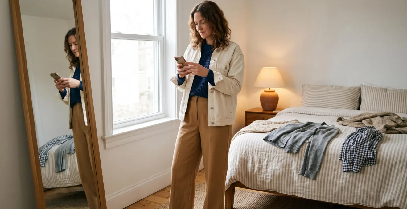
An outfit can look perfectly coordinated in your bedroom mirror, then strangely mismatched in a daylight photograph. The problem may have little to do with the price, fit or quality of your clothes. Often, it comes down to how their colours interact with each other, the surrounding light and your camera.
Basic colour theory gives you a practical way to make those interactions more intentional. By understanding colour temperature, lightness, contrast and proportion, you can create combinations that photograph as cohesive rather than accidental.
You do not need an entirely new wardrobe or a professional colour analysis. A few familiar garments, a window and your phone are enough to start identifying what works.
The aim is not to make every outfit monochromatic or eliminate interesting combinations. It is to create a recognisable visual relationship between garments, particularly around your face and wherever different fabrics meet. That sense of coordination can contribute to a polished, expensive-looking impression without requiring expensive clothing.
Colour theory essentials for a more cohesive wardrobe
- Check colour combinations in more than one lighting condition because garments and cameras can respond differently to indoor light and daylight.
- Start with one dominant colour, support it with a secondary shade and use accents deliberately rather than distributing every colour equally.
- Build your personal palette around the neutrals and colours you already wear, then test additions before buying them.
- Why Do Colours That Match in Your Bedroom Clash in Daylight?
- How to Build a 3-Colour Outfit Using Undertones Without Overthinking?
- Warm Neutrals or Cool Neutrals: Which Makes You Look Less Tired on Video Calls?
- The Colour Mistake That Makes You Look Mismatched Even in Neutral Outfits
- In What Order Should You Add Colours to Your Wardrobe If You Wear Black 80% of the Time?
- How to Build a Personal Colour Palette From 12 Items You Already Own?
- How to Choose 2 Base Neutrals That Match 90% of Your Wardrobe?
- How Do You Build a Colour Palette That Makes Getting Dressed Faster Every Morning?
Why Do Colours That Match in Your Bedroom Clash in Daylight?
Colours that match indoors can clash in daylight because different light sources change how fabrics reflect and display colour. Warm bedroom lighting may make two garments appear similar, while natural light reveals differences between their blue, green, yellow or reddish undertones. Camera white balance can further change the apparent relationship between those colours.
One scientific explanation is metamerism. Two surfaces with different spectral reflectance characteristics can appear identical under one illuminant and different under another. Research published in the Journal of the Optical Society of America A on colour metamerism explains this phenomenon, while also indicating that particularly dramatic metameric differences are uncommon.
Not every change in an outfit’s appearance is metamerism. Sometimes the entire scene takes on a colour cast. A warm household lamp may make a white shirt appear yellowish, while other indoor lighting can introduce a green tint.
Camera processing adds another variable. As Nikon’s explanation of camera white balance describes, cameras adjust colour reproduction to account for different lighting conditions, but automatic correction does not always produce the appearance you expect.
Imagine a hypothetical outfit pairing a deep blue jumper with a muted green scarf. Under a warm lamp, both may appear similarly subdued. Near a window, the scarf’s yellow-green character might become more noticeable beside the jumper’s cooler blue.
To check a combination, place the garments beside a window around midday, away from direct sunlight that creates harsh highlights. Inspect the boundary where the fabrics touch, then take a photograph. Repeat under the indoor lighting where you normally get dressed.
Keep your camera settings and framing as consistent as possible. A phone photo shows how your particular device renders the outfit; it is not inherently a more accurate measurement of physical colour than your eyes.
If a pairing only looks harmonious under one light source, consider it a lighting-sensitive combination. That does not mean it is wrong, but it deserves another check before an event where photography matters.
Once you know how the lighting affects your clothes, the next challenge is arranging several colours into one deliberate-looking outfit.
How to Build a 3-Colour Outfit Using Undertones Without Overthinking?
A practical three-colour outfit starts with one dominant neutral, adds a smaller secondary colour and finishes with a restrained accent. Rather than giving all three colours equal visual importance, establish a clear hierarchy. Check whether the garment undertones feel compatible, then adjust the proportions until the outfit looks like one coordinated decision.
A useful starting point is the 60-30-10 approach: approximately 60% dominant colour, 30% secondary colour and 10% accent. It comes from general design practice rather than a scientifically validated clothing formula.
For example, try camel trousers and a matching outer layer as the dominant visual area, a navy jumper as the secondary shade and a small burgundy accessory as the accent.
Adobe’s colour-wheel and colour-harmony guide explains how dominant colours, complementary combinations and analogous schemes can help establish visual balance. The same principles provide a useful framework for clothing, although no particular ratio guarantees an expensive-looking result.
Garment undertones matter separately from skin undertones. A neutral may lean yellow, red, blue or green without looking obviously colourful. Two garments can have similar lightness but different temperature characteristics.
Hold each item near a neutral white surface in consistent daylight. The comparison may make a yellowish cream or bluish grey easier to recognise. White paper is a convenient visual reference, not a scientifically reliable undertone measurement, particularly when optical brighteners or coloured surrounding light are involved.
When time is limited, select one reliable anchor: perhaps a navy blazer that consistently photographs well. Build the rest of the outfit around its colour and visual weight instead of choosing three unrelated pieces.
If your statement garment already contains several colours, such as a patterned skirt combining rust, cream and navy, treat those colours as the starting palette. Choose accompanying items from within the pattern rather than automatically introducing another shade.
Equal colour proportions are not inherently unattractive. However, a dominant colour creates an especially simple route to visual organisation when you want a restrained, polished result.
The formula becomes even more useful when selecting clothes close to your face, where lighting and colour contrast influence your appearance on video.
Warm Neutrals or Cool Neutrals: Which Makes You Look Less Tired on Video Calls?
Neither warm nor cool neutrals automatically make everyone look less tired on video calls. The better choice depends on your complexion, the light illuminating your face, the contrast between your skin and clothing, and your camera settings. Test cream, camel, grey and navy on screen to identify which creates balanced, flattering contrast.
Warm neutrals include colours such as cream, camel, warm beige and some taupes. Cool neutrals include blue-grey, charcoal, cool navy and certain bright whites. Each can create a different impression when worn directly beneath the face.
A light-coloured garment may reflect some of the surrounding light towards your skin, although its practical effect depends on the lighting arrangement and material. Colour alone does not reliably remove under-eye shadows or redness.
For example, a cream jumper might create a softer-looking transition against one complexion, while a charcoal top could provide stronger facial definition for another. A bright white shirt may also affect automatic exposure, particularly when it occupies a substantial portion of the camera frame.
The quickest way to compare options is to run a controlled self-test:
- Sit in your usual video-call position with the same background and lighting.
- Take a screenshot wearing a warm neutral near your face.
- Change to a cool neutral while keeping camera framing and lighting unchanged.
- Compare facial contrast, apparent shadows and the relationship between your clothing and skin.
- Repeat if automatic exposure or white balance visibly changes between shots.
A garment very close to your skin tone in both lightness and colour can create little separation between face and clothing. At the opposite extreme, very strong contrast may draw attention to the boundary between them. The ideal balance is personal rather than universal.
Also distinguish colour temperature from lightness. A pale cream and deep navy differ in several ways, so comparing them does not isolate temperature. A warm beige versus a similarly light cool grey makes a more informative comparison.
Daylight and indoor lighting can each favour different combinations depending on the full scene. Cool colours are not inherently better outdoors, and warm neutrals do not automatically outperform them on webcams.
If you spend most weekdays on video calls but regularly attend photographed events outdoors, choose a neutral family that performs well in your dominant setting while retaining alternatives for other environments.
Once your most useful neutrals are identified, check whether their undertones work together across the rest of your outfit.
The Colour Mistake That Makes You Look Mismatched Even in Neutral Outfits
A common reason neutral outfits look mismatched is an unintended contradiction between garment undertones. Cream, brown and olive may lean warm, while certain greys, charcoals and whites lean cool. Their differences can become noticeable when adjacent fabrics are photographed together, even when every item appears neutral on its own.
Neutral colours are particularly deceptive because their underlying hues are subtle. A cream shirt might look straightforward until it sits beside a bright, bluish white jacket. The shirt suddenly appears more yellow, while the jacket looks cooler.
Another hypothetical example is an outfit combining a warm mushroom-grey jacket with cool blue-grey trousers. Both items might be labelled grey by a retailer, but their relationship can appear less intentional than expected.
This is not proof that warm and cool neutrals should never mix. Temperature contrast can be deliberate and aesthetically effective, especially when another element repeats or connects the two shades.
For example, cool charcoal trousers and a warm oatmeal jumper could work alongside a textured denim jacket or patterned scarf that visually relates to both. Material, saturation, contrast and overall styling also affect the result.
A simple checking method is to lay the neutral pieces together on a white sheet in indirect daylight. Examine which ones lean towards yellow, orange, blue or green relative to each other. Then look at the complete outfit rather than rejecting a garment solely because its undertone differs.
If the contrast feels distracting, try replacing one item with a more compatible shade. Alternatively, introduce a mid-tone bridge such as taupe or denim and assess whether the relationship feels more intentional.
Use colour consistency as a tool, not a restriction. Some of the most interesting neutral outfits deliberately combine contrasting temperatures.
For anyone whose wardrobe is mostly black, these relationships become especially relevant when introducing colour for the first time.
In What Order Should You Add Colours to Your Wardrobe If You Wear Black 80% of the Time?
If you wear black most days, introduce colour gradually rather than replacing your wardrobe all at once. Begin with charcoal and grey, experiment with white or off-white for contrast, then add one darker saturated colour such as burgundy, forest green or deep blue. Choose pieces that already coordinate with the black clothing you own.
Black creates a dependable starting point because it offers a strong contrast against lighter garments and often allows saturated colours to stand out clearly.
The first additions can focus on lightness rather than hue. Charcoal creates a subtle change from black. Mid-grey makes the difference more visible. White or cream introduces stronger contrast, giving you a way to test how much separation you enjoy in photographs.
Once that feels comfortable, consider a colour with moderate or deep value. Burgundy trousers, an emerald blouse or a dark teal jumper can introduce colour while maintaining a relatively restrained overall appearance.
Pale pastels against black can also work beautifully, but the strong lightness contrast may make the pastel garment the immediate focal point. Whether that flatters your face depends on placement, lighting and complexion, not a universal rule about pastels.
Black is achromatic, meaning it has no hue in the usual colour-wheel sense. Nevertheless, black fabrics can differ in dye cast, finish and fading, making some appear bluish, brownish or greenish beside other garments.
For that reason, photograph a potential new colour against the black pieces you actually wear. A black jacket with a cool-looking surface may interact differently with a warm rust top than a softer faded black knit does.
Before buying, apply a simple wardrobe test: can this colour work with black and at least one existing non-black item?
For example, a burgundy cardigan that pairs with black trousers and your grey skirt has an obvious role in your wardrobe. A striking colour that works with nothing else may require additional purchases before it becomes useful.
After introducing a few alternatives, it becomes easier to identify the colours you genuinely wear, which is the foundation of a personal palette.
How to Build a Personal Colour Palette From 12 Items You Already Own?
Build a personal colour palette by photographing twelve of your most-worn garments in consistent daylight, then grouping their colours by temperature, lightness and saturation. Identify the shades that repeat most often and use them as the foundation for future outfits. This reveals your actual clothing habits rather than an idealised shopping palette.
The twelve-item exercise is a practical wardrobe audit, not a scientifically established optimal sample size. Its value comes from limiting the exercise to clothes you regularly choose.
Select items across useful categories: tops, trousers, outerwear and versatile layers. Avoid filling the selection with rarely worn pieces simply because you like their colours.
Arrange the garments on a white sheet in indirect daylight. Photograph them with the same camera and lighting conditions, either individually or together. A digital colour picker can help create an approximate swatch for each item, but phone processing, fabric texture and shadows can make those sampled colours imperfect.
Next, sort the colours into loose groups. Are your clothes predominantly warm browns and creams? Cool greys and blues? Dark, saturated shades? Or do you intentionally wear a wider mixture?
There is no universal requirement that a healthy wardrobe contain one temperature family or a narrow lightness range. However, noticing repeated patterns can explain why certain garments combine effortlessly while others require more experimentation.
Your five-step wardrobe palette audit
- Select twelve frequently worn garments. Create a numbered inventory showing the item type and its main colour.
- Photograph them in consistent daylight. Save a complete set of twelve reference images against a neutral white background.
- Extract their dominant colours. Produce a digital or handwritten palette containing twelve approximate colour swatches.
- Group the colours. Label each swatch by approximate temperature and lightness, then identify the most frequent families.
- Test future compatibility. Write a short buying rule naming your core colours, preferred contrasts and the pieces a new purchase should match.
If the audit reveals two distinct groups, such as warm espresso browns and cool black-and-grey pieces, you do not necessarily have to discard one. Consider which group supports your everyday outfits and which is more useful for specific occasions.
Your purchasing filter should encourage consistency without becoming inflexible. A new item that fits your common colour relationships is likely to be easier to incorporate, while a deliberately contrasting piece may still be worth buying.
The strongest recurring colours in that audit provide the evidence you need to choose your wardrobe’s most useful base neutrals.
How to Choose 2 Base Neutrals That Match 90% of Your Wardrobe?
Choose two base neutrals by identifying the most versatile shades in your existing wardrobe, ideally with enough difference in lightness to create visible outfit structure. Test both against your major garments before committing. The 90% figure is a wardrobe-planning target, not a proven level of compatibility that any particular neutral pair guarantees.
For many wardrobes, choosing one dark and one light neutral makes layering easier. Possible combinations include espresso and cream, charcoal and oatmeal, or navy and soft grey.
Matching temperature families can simplify coordination, but it is not an absolute requirement. Contrast in hue, texture or saturation can also make a mixed-temperature neutral pairing work effectively.
The decision should come from your own wardrobe rather than a universal list of flattering colours. A closet dominated by olive, camel and chocolate brown may be more compatible with espresso and cream than with stark black and bright white.
To make this measurable, create a simple compatibility record for the garments in your audit. For each potential base neutral, mark which pieces you would confidently combine with it. Then test the proposed neutral pair together.
Compare several possibilities before settling on your preferred foundation:
| Neutral pair | Potential advantage | What to check |
|---|---|---|
| Espresso + cream | Distinct light-dark contrast with a predominantly warm impression | Compatibility with cool grey and blue garments |
| Charcoal + oatmeal | Soft contrast between a dark grey and a lighter neutral | Whether the oatmeal reads too yellow beside the charcoal |
| Navy + soft grey | Useful foundation for understated professional outfits | Interaction with existing warm browns and creams |
| Black + white | Strong contrast and easily recognisable visual structure | Whether the contrast feels too sharp for your preferred outfits |
Neutral basics can simplify outfit planning. Emerson College’s advice on building a professional wardrobe recommends versatile neutral colours that can be mixed and matched, while also allowing for individual preferences and more expressive pieces.
However, neither that advice nor general colour theory establishes that exactly two neutrals will coordinate with 90% of everyone’s clothes.
Instead, calculate compatibility for your own wardrobe by counting which pieces genuinely work with your proposed foundation. If an attractive neutral repeatedly clashes with garments you wear often, it is a poor everyday base regardless of how versatile it appears in a mood board.
Once the foundation is established, it can become a shortcut for getting dressed, provided you allow enough flexibility for the colours and combinations you enjoy.
Key takeaways before building your final palette
- Choose core colours based on repeatable combinations in your wardrobe, not simply on individual garments that look attractive.
- Test both neutral foundations under the lighting conditions that matter to your daily life.
- Keep a deliberate space for accents or statement pieces so consistency does not eliminate personal expression.
How Do You Build a Colour Palette That Makes Getting Dressed Faster Every Morning?
A practical wardrobe palette speeds up getting dressed by reducing the number of unfamiliar colour combinations you need to evaluate. Choose two dependable base neutrals, a few compatible supporting shades and a limited selection of accents. Test common combinations in real lighting, then use those tested pairings as ready-made options rather than starting from scratch each morning.
The efficiency comes from replacing repeated experimentation with familiar choices. Instead of wondering whether an unfamiliar jacket works with three pairs of trousers, you already know which combinations you like in person and on camera.
For example, a hypothetical wardrobe might use espresso and cream as its base neutrals, olive and muted blue as supporting colours, and rust as an accent.
These colours do not all need identical undertones. What matters is whether the combinations you plan to wear create the visual relationship you want.
A manageable palette should support several outfit structures: a light top with dark trousers, a darker monochromatic combination, a restrained contrast between neutrals and an occasional outfit built around one more expressive garment.
Before treating the palette as complete, check three things:
- Compatibility: Each everyday garment should work with at least one base neutral, and ideally offer more than one useful outfit combination.
- Controlled variety: Keep accent colours limited enough to coordinate easily, without imposing an arbitrary maximum.
- Real-world appearance: Photograph your most common combinations in daylight and test any outfits intended for frequent video calls in your normal screen setup.
Not every piece must work with both base neutrals. A patterned statement jacket or occasional formal garment can serve a useful purpose even if it only has a few suitable companions.
To prevent palette drift, repeat a small compatibility check whenever you buy something new. During its first wear, compare the new piece against your two base neutrals in natural light and photograph the combinations you expect to use.
Save successful outfits in a dedicated phone album. Over time, those photographs become a practical visual catalogue, particularly when an early morning or last-minute professional event leaves little time for experimentation.
The system should also preserve room for creativity. Reserve an optional accent zone for pieces outside your core palette. A bright cobalt bag or an unusual patterned shirt does not have to satisfy every rule to deserve a place in your wardrobe.
A restricted palette is a convenience, not a measure of style expertise. Different textures, silhouettes and deliberate colour contrasts can all contribute to a refined appearance, even when they depart from your usual combinations.
Start with one outfit you already enjoy wearing. Photograph it beside a window, identify its dominant neutral and supporting colours, then use those shades to assemble two additional combinations from clothes you own. You will have the beginnings of a functional palette without buying anything new.
Can colour coordination make inexpensive clothes look more expensive in photos?
Intentional colour relationships can create a polished visual impression, regardless of a garment’s price. A restrained palette, clear colour hierarchy and compatible lighting may help an outfit appear more cohesive. However, there is no established colour formula that guarantees clothing will be perceived as expensive. Fit, fabric condition, texture, styling and photographic quality also contribute.
Should outfit colours match perfectly in every photograph?
No. Cameras, exposure settings, white balance and different light sources can alter the appearance of fabric colours. Aim for combinations that look intentional under your usual conditions rather than identical colour reproduction across every photograph. Contrasting colours can also work beautifully without matching closely.
Can you mix warm and cool colours in the same outfit?
Yes. Warm and cool colours can create effective contrasts when balanced through proportion, repetition, lightness or a connecting accessory. Keeping a consistent temperature family is a convenient shortcut for simple outfits, not a universal requirement. Test the whole combination rather than judging undertones individually.
Does your personal colour palette need to match your skin undertone?
Not necessarily. Skin tone can influence how a colour appears near your face, but your personal wardrobe palette also depends on garment combinations, preferred contrast, lighting and individual taste. You can wear colours outside a presumed skin-undertone category and adjust their placement with scarves, collars or outer layers.
How can you stop phone cameras from changing your outfit colours?
Use consistent, preferably indirect lighting, avoid mixing strongly different light sources and keep camera settings as stable as possible. If your phone allows it, lock exposure and white balance for comparisons. Automatic processing cannot always reproduce fabric colours exactly, so compare images under similar conditions rather than relying on one photograph as an absolute reference.