
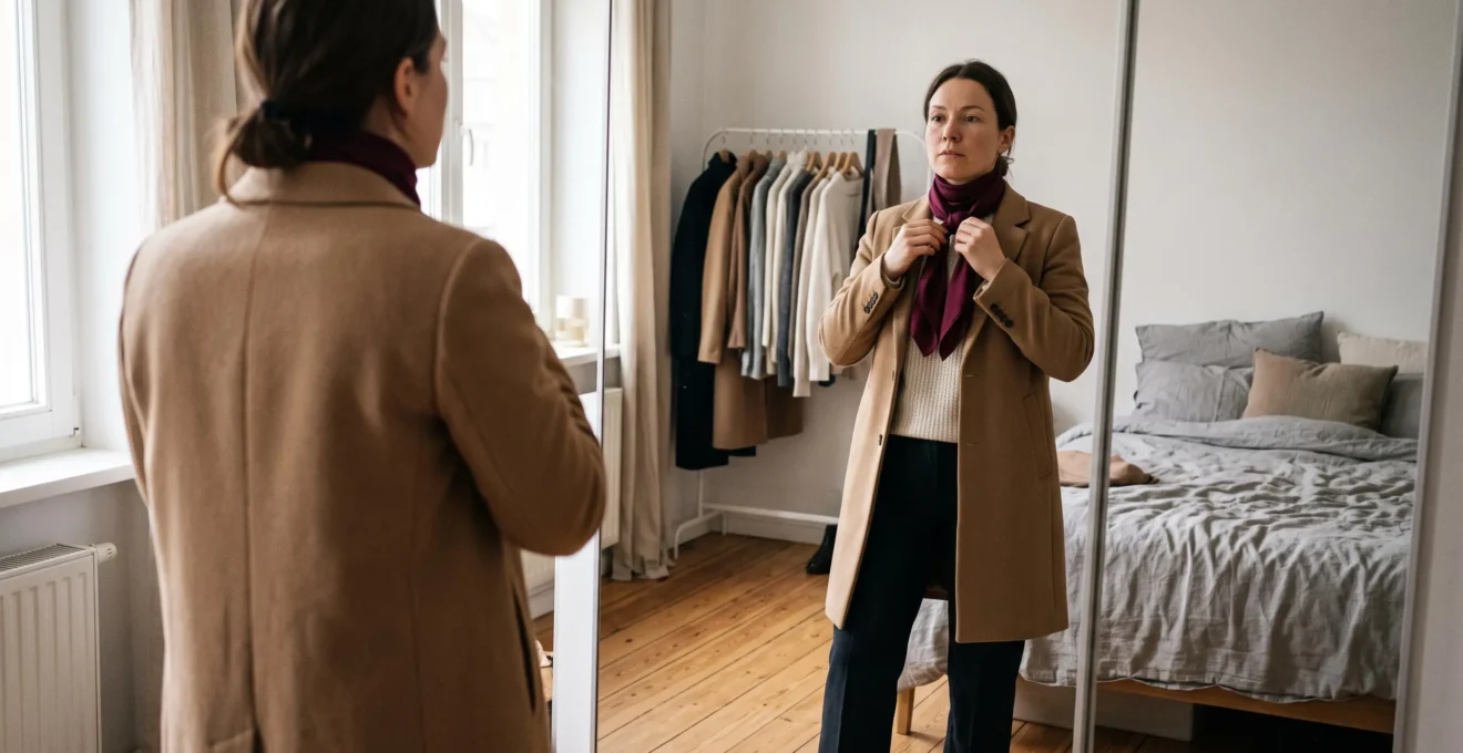
Adding colour to a neutral wardrobe does not mean abandoning the understated style that makes your clothes easy to wear. A burgundy scarf, forest-green cardigan or muted-blue pair of shoes can introduce personality while leaving the rest of an outfit calm and cohesive.
The simplest approach is to build your neutral outfit first, then introduce one accent colour in a controlled amount. Start with an accessory or one versatile garment, keep the surrounding colours compatible, and let the accent provide a clear point of interest.
The goal is not to make every outfit brighter. It is to make your colour choices feel deliberate without requiring complicated styling rules, expensive replacements or perfect matching.
Whether you mostly wear black, cream, grey, navy or camel, a few practical decisions about placement, proportion and undertone can make experimenting with colour considerably less intimidating.
Accent colours without the overwhelm
- Start with a complete neutral outfit and add one noticeable colour in a relatively small area.
- If you repeat an accent, vary its scale, placement or texture rather than matching everything exactly.
- Choose colours that work with your existing wardrobe, and test shades near your face before investing in larger garments.
- Why Do Accent Colours Make You Look More “Styled” Even With Basic Clothes?
- How to Add One Accent Colour in 3 Places Without Looking Matchy-Matchy?
- Accent Shoes or Accent Knitwear: Which Gets More Use in a Neutral Wardrobe?
- The Accent Colour Mistake That Can Make You Look Washed Out
- When Should You Add the Accent Colour So the Outfit Still Feels Clean?
- How to Build a 3-Colour Outfit Using Undertones Without Overthinking?
- When Should You Add an Accent Colour Without Replacing Half Your Wardrobe?
- How Do You Build a Colour Palette That Makes Getting Dressed Faster Every Morning?
Why Do Accent Colours Make You Look More “Styled” Even With Basic Clothes?
Accent colours can make basic clothes look more intentionally styled because they create a recognisable focal point. Against a restrained background, even a small contrasting detail attracts attention and helps organise the outfit visually. The effect comes from the relationship between the accent and surrounding garments, not from wearing an especially bright or fashionable colour.
Consider two otherwise identical outfits: cream knitwear, charcoal trousers and black loafers. One remains entirely neutral; the other includes a burgundy scarf. Neither is automatically better, but the second has a more obvious point of emphasis. That small decision can communicate a sense of deliberate coordination.
This follows a broader principle of visual composition. The Open University‘s lesson on emphasis and dominance explains how contrast, colour, scale and placement help establish visual focal points. Applied to clothing, the principle suggests why a modest coloured detail can become noticeable against a quieter background.
The important distinction is between an accent colour and a dominant colour. A red coat worn over a neutral outfit may become its dominant visual feature. A red scarf with the same outfit is more likely to act as an accent.
Surface area matters, but so do intensity, contrast and position. A tiny fluorescent accessory might attract more attention than a much larger muted-blue cardigan. There is no universally correct percentage of colour that guarantees sophistication.
This is reassuring if you associate accents with daring shades. Dusty rose, olive, chocolate-plum and soft teal can all work as accents when they stand apart from the colours around them. Even black can act as an accent against an otherwise pale outfit.
The wardrobe matters more than the absolute brightness of a shade. The Concept Wardrobe‘s colour palette planning article likewise defines accent colours by how strongly they stand out relative to the rest of a personal palette.
A neutral outfit does not need an accent to be stylish. Colour is simply another way to introduce intention, particularly when you want familiar basics to feel a little more personal.
How to Add One Accent Colour in 3 Places Without Looking Matchy-Matchy?
To repeat one accent colour in three places without looking overly coordinated, use different amounts of it, distribute the details across the outfit and avoid insisting on identical shades or materials. A small accessory, a medium-sized item and a discreet finishing touch can create continuity without making the outfit resemble a matching set.
For example, imagine a white Oxford shirt with navy chinos and tan suede boots. Forest green could appear through a narrow watch strap, a canvas tote bag and a small section of sock above the boot.
The pieces are related, but they do not compete equally for attention. The tote provides the clearest accent, while the watch strap and socks reinforce it.
Graduated repetition is generally easier to wear than three equally prominent accents. A bright-red jacket, handbag and shoes can feel much more coordinated than someone seeking a subtle everyday outfit might want.
Spacing also changes how colour repetition reads. Instead of clustering three coloured items around the shoulders and neck, distribute them across separate areas of the silhouette. An accent near the upper body, one around the waist or hand, and another near the feet can create a visual connection without an obvious block of colour.
The idea is related to repetition in visual design. University of Wisconsin–Madison‘s visual design principles describe how repeated elements can establish unity, while spatial relationships influence whether elements feel connected or separate. Applying those concepts to outfits is a practical styling interpretation, not a scientifically established three-item rule.
Texture is another useful way to avoid literal matching. A matte forest-green canvas bag can coordinate with a dark-green leather strap without looking like both pieces came from an accessories set. Similarly, burgundy wool and slightly deeper wine-coloured leather can create a relationship without matching precisely.
The hues should be recognisably related, but similar is often enough. Trying to find three identical versions of one colour can make getting dressed unnecessarily difficult.
And three repetitions are an option, not a requirement. If a cobalt-blue bag already provides the personality you want, there is no reason to find two additional cobalt accessories.
For a truly understated wardrobe, the best starting point may be one accent, followed by a second small echo only when the outfit benefits from it. Whether that accent belongs on your shoes or knitwear depends on how you dress day to day.
Accent Shoes or Accent Knitwear: Which Gets More Use in a Neutral Wardrobe?
Accent knitwear will often be the more versatile choice if your wardrobe contains mostly neutral trousers, jeans and simple tops, because a coloured cardigan or jumper can transform a familiar base. Accent shoes may be more useful if your tops already have variety or you prefer colour away from your face. The better investment depends on actual wearing opportunities.
Imagine owning several pairs of black, navy and grey trousers, but mainly cream and white tops. A burgundy cardigan could work with multiple combinations, introducing colour without changing your shoes, outerwear or accessories.
Now imagine that your wardrobe already includes striped shirts, textured knits and patterned blouses. A pair of muted-green shoes could add interest to your simpler outfits without introducing another prominent colour around the shoulders.
There are also practical differences worth weighing before buying.
| Consideration | Accent shoes | Accent knitwear |
|---|---|---|
| Visual placement | Lower silhouette, away from the face | Upper silhouette, usually near the face |
| Best wardrobe fit | Simple outfits that need a finishing detail | Neutral bottoms and repeatable outfit bases |
| Main practical constraint | Weather, comfort, walking and dress codes | Season, temperature, layering and care |
| Colour flexibility | Can accommodate bolder shades without directly framing the complexion | Benefits from checking the colour against the face |
| Potential drawback | May compete with more practical everyday footwear | Frequent repetition may make outfits feel too similar |
Footwear must satisfy practical requirements that colour cannot override. Even a perfectly chosen pair of bright-blue shoes may see little use if they are unsuitable for wet weather, long walks or your workplace.
Knitwear has its own limitations. A coloured wool jumper may be useful through colder months but less relevant in warm weather. A lightweight cardigan could offer more layering flexibility, depending on your climate and routine.
One overlooked consideration is visual fatigue. Wearing the same bright jumper repeatedly may make your outfits feel more repetitive, even if the combinations remain harmonious. Coloured shoes may feel less dominant because they occupy a smaller or less immediately noticeable part of your look.
This is subjective rather than a measured rule. Neither category can be declared universally more cost-effective without knowing your wardrobe and how frequently you would wear each item.
Before purchasing, assemble several complete outfits using what you already own and mentally substitute the coloured item. If you can picture wearing it across different days and situations without buying coordinating pieces, it is a promising candidate.
Wherever you place the colour, consider whether its proximity to your face changes the way your complexion appears. That distinction can make the difference between an accent you admire on a hanger and one you enjoy wearing.
The Accent Colour Mistake That Can Make You Look Washed Out
The most common practical mistake is choosing an accent because it looks attractive on its own without checking how it appears against your face. A muted or poorly contrasting shade placed near the neckline may make your features look less defined. The same colour could work beautifully as shoes, a belt or a bag.
A colour does not have a fixed effect on everyone. Its appearance depends on surrounding colours, lighting, skin tone, contrast and personal preference. A pale pastel might flatter one person but make another feel washed out, while a stronger version of the same hue may work better.
There are two separate issues to investigate: undertone compatibility and insufficient visual contrast.
Undertones describe whether a shade tends to lean warm, cool or relatively balanced. A yellow-leaning beige and a pink-leaning beige can behave differently beside the face, even when their overall lightness is similar.
Meanwhile, low saturation and low contrast can make an outfit feel visually flat. For example, a very muted pink scarf against a soft beige jumper may not provide enough separation to create the accent you intended.
In that case, the solution might be to try a deeper rose or burgundy rather than abandoning pink altogether.
A quick comparison test helps you make the decision without memorising a seasonal colour system:
- Stand near a window in consistent, indirect daylight, avoiding strongly coloured artificial lighting.
- Wear a simple neutral top, preferably one you frequently use.
- Hold the candidate scarf or fabric directly below your chin.
- Compare it with a lighter, darker, warmer or cooler alternative while keeping the lighting and background consistent.
- Notice whether your features appear more defined, whether unwanted shadows seem more noticeable and, most importantly, which version you personally prefer.
This is a subjective styling test, not a diagnostic method for determining a scientifically correct colour category. Lighting, makeup, neighbouring fabrics and individual perception can all influence what you see.
It is also misleading to assume that bright colours never suit fair complexions or that muted colours are inherently safer. Some people may find a clear red more flattering than a dusty pink, regardless of how bold either shade sounds.
As an alternative, keep a colour you enjoy away from your neckline. A mustard bag can introduce the same personality as a mustard scarf without framing your face.
Once you find a colour you enjoy wearing, the next challenge is keeping it from competing with the rest of the outfit.
When Should You Add the Accent Colour So the Outfit Still Feels Clean?
Add the accent after assembling the neutral foundation, not before, when your goal is a clean, understated outfit. This allows you to assess the complete silhouette, textures and accessories before deciding whether additional colour is necessary. If the base already contains several visually prominent details, the best decision may be to leave the accent out.
Suppose you begin with charcoal trousers, a cream shirt and a simple navy jacket. Once the proportions and neutral colours feel balanced, a burgundy bag or scarf can be introduced as the finishing detail.
Compare that with starting from an eye-catching red bag, then adding patterned trousers and a bright jacket to make the outfit feel interesting. Nothing about that combination is automatically wrong, but it may conflict with your original intention to keep the look understated.
Think of an outfit as having a limited visual attention budget. Colour, prints, contrast, shine, striking silhouettes and pronounced textures can all draw attention. This is a practical metaphor, not a numerical design formula.
A colourful scarf and a delicate necklace may coexist comfortably. The same scarf alongside a large graphic print, reflective metallic accessories and multiple contrasting layers can create several competing focal points.
However, textured clothing is not inherently busy. Fine ribbing, tonal denim or subtle wool texture can add depth without requiring you to avoid colour entirely. Judge the overall visual impact rather than counting elements mechanically.
Context matters too. In a formal setting, you might want the tailoring or a carefully chosen accessory to remain the main point of attention. In a relaxed weekend outfit, an accent can be more playful.
A helpful final check is to look at the completed outfit from a distance or take a photo and reduce it to a small thumbnail. Ask where your eye goes first. If the accent is noticeable but the overall silhouette still feels balanced, you have likely achieved the effect you wanted.
If your attention jumps between several unrelated elements, try removing one, reducing its contrast or exchanging it for a neutral.
Once the amount of colour feels comfortable, a simple three-colour structure can help you assemble outfits even faster.
How to Build a 3-Colour Outfit Using Undertones Without Overthinking?
Build a three-colour outfit by choosing one dominant colour, one supporting colour and one accent. In a neutral wardrobe, the first two can be familiar neutrals, such as navy and cream, leaving only the accent to decide. Keeping the colours within a broadly compatible warm or cool family can simplify coordination, although mixing temperatures is not inherently wrong.
Start with an outfit you already wear successfully. If navy trousers and a cool white shirt form your usual base, try adding a muted-blue, berry or cool-green accessory. If camel and cream are your preferred neutrals, rust, olive or warm burgundy may be comfortable starting points.
These are styling examples, not universal rules about which shades belong together. Colour temperature exists alongside lightness, saturation and contrast, all of which influence how a combination appears.
For practical everyday dressing, begin with this structure:
- Dominant colour: the colour covering the largest visible area, such as navy trousers and a navy jacket.
- Supporting colour: the neutral that separates or balances the dominant colour, such as an ivory shirt.
- Accent colour: the smaller contrasting feature, such as an olive scarf or berry handbag.
There is no need to purchase three colourful garments. Two of the three colour roles can be filled by items you already own.
The terms hue, value and intensity are useful when a combination feels slightly off. Hue identifies the colour family, value concerns relative lightness or darkness, and intensity concerns how bright or subdued it appears. These distinctions are explained in Utah State University‘s clothing and textile design fact sheet.
If your outfit lacks contrast, try changing the value of an accessory. If it seems too vivid, explore a less saturated version. You do not necessarily need to change its hue.
Undertones can act as a shortcut rather than another source of rules. If you are uncertain, keeping your neutrals broadly warm or broadly cool is a reasonable starting point. Yet warm-cool combinations can also look intentional when their contrast is balanced.
Most importantly, cohesion does not require exact matching. A navy, ivory and burgundy outfit can look connected even though none of the colours duplicates another.
Repeating this approach will also reveal which accents genuinely complement your wardrobe, making it easier to introduce new colour without replacing familiar staples.
When Should You Add an Accent Colour Without Replacing Half Your Wardrobe?
Add an accent colour when it works with most of the neutral outfits you already wear and does not require additional purchases to make it usable. Begin with something small and reversible, such as a scarf, bag or other accessory. Invest in a larger coloured garment only after confirming that the shade fits your routine, personal preferences and existing wardrobe.
Before buying anything, identify your dominant neutrals. Are your clothes mainly black, white and charcoal? Or do you own more camel, cream, chocolate and olive? A colour that complements your actual clothing will generally be easier to integrate than one selected solely from an attractive inspiration image.
Next, compare the commitment involved in different entry points:
| Entry point | Best reason to choose it | What to check |
|---|---|---|
| Small accessory | Low-commitment colour experimentation | Does it coordinate with several outfits you already wear? |
| Shirt, cardigan or jumper | More visible colour in regular outfits | Does it suit your preferred layering and neckline combinations? |
| Jacket or coat | A prominent, recurring signature accent | Will it work with most outfits worn beneath it? |
A useful personal buying threshold is whether the proposed accent works with a majority of the everyday combinations you genuinely rely on. This is a decision aid rather than an industry standard. If it coordinates with only one outfit and needs several supporting purchases, the real wardrobe commitment may be much larger than expected.
Consider the difference between a lasting signature colour and a seasonal novelty. A deep-green cardigan you enjoy with most of your neutrals may remain useful for years. A trendy shade that appeals only because you keep seeing it online may be less satisfying once its novelty fades.
That does not make seasonal colour experimentation a mistake. It simply deserves a different level of commitment, particularly if your priority is avoiding unnecessary purchases.
The following five-step check turns these ideas into a practical wardrobe decision.
Your five-step accent-colour wardrobe check
- Identify your neutral foundation. Write down the two or three neutral colours most common in your regularly worn clothes. Your result is a short, accurate base-colour list.
- Select one candidate accent. Choose a shade you already enjoy, ideally using an existing garment or accessory as the reference. Your result is one clearly named colour.
- Test real combinations. Lay the candidate beside at least five everyday outfits or outfit combinations from your wardrobe. Your result is a simple record of which combinations look usable.
- Choose the smallest suitable purchase. Decide whether an accessory, knitwear item or larger garment fits your intended frequency of wear. Your result is a specific item category, not an open-ended shopping list.
- Check for hidden dependencies. Note any additional purchases the item would require. Your result is a buy-or-skip decision based on compatibility with what you already own.
These steps are especially useful when you like the idea of a colourful wardrobe but do not want to accumulate isolated statement pieces that rarely leave the hanger.
Once a few compatible accents have proved their value, you can turn those choices into a repeatable personal palette that reduces unnecessary outfit decisions.
Key takeaways for building your personal palette
- Use the neutral colours you already wear most often as the foundation, rather than copying a palette from an inspiration board.
- Retain accent shades that combine easily with your usual clothing and feel comfortable near your face or in your preferred accessory positions.
- Evaluate future purchases against the same small set of colours so that compatibility becomes easier to predict.
How Do You Build a Colour Palette That Makes Getting Dressed Faster Every Morning?
Build a practical colour palette by selecting two or three neutrals from your existing wardrobe, then adding one or two accents that coordinate with them. Use this palette to guide outfit combinations and future purchases. The aim is to reduce unnecessary decisions by making familiar pieces easier to combine, not to restrict your style to a rigid colour system.
Begin with what you actually wear. If your most reliable pieces are navy trousers, white shirts, charcoal knitwear and a burgundy scarf, those garments already suggest a functional palette.
You do not need to discard clothes that sit outside it or buy matching replacements. The palette should describe the wardrobe you enjoy using before it becomes a guideline for future choices.
The practical structure is simple:
- Choose two or three base neutrals that appear frequently in your current outfits.
- Identify one accent you already enjoy and can combine with several of those neutrals.
- Add a second accent only if it creates genuinely useful variety.
- Compare future purchases against your existing clothes rather than against isolated product photographs.
- Revisit your palette when your lifestyle, preferences or most-worn garments change.
For example, a wardrobe built around navy, cream and charcoal might use burgundy as a primary accent and muted green as an occasional alternative. Those colours offer several potential combinations without requiring each garment to match every other one.
The time-saving idea is straightforward: when your most frequently worn pieces share compatible colours, you may need fewer rounds of trying on and rejecting combinations.
However, there is no established guarantee that a particular number of wardrobe colours will measurably reduce dressing time. Fit, weather, comfort, formality and the organisation of your wardrobe also influence how quickly you get dressed.
A useful test is to pull three everyday pieces from your wardrobe and try them together. Repeat this with different combinations. If the results frequently feel disjointed, inspect whether one colour, pattern or garment category is making coordination difficult.
It may be a palette issue, but it could just as easily be a difference in formality, silhouette or season. The answer is not always to buy more matching colours.
Make the palette a filter, not a restriction. A surprising shade can still be a worthwhile addition when you love it and have a clear way to wear it. Its usefulness matters more than whether it fits a diagram perfectly.
For your next outfit, choose your usual neutral base, add one accent you already own and check the result in a mirror. Repeat the combination if you enjoy wearing it. Over time, those successful choices will provide a more dependable personal palette than any theoretical list of colours.
Can black be an accent colour in an otherwise light outfit?
Yes. An accent is defined by its visual relationship with the surrounding colours, not necessarily by its brightness. A black belt, bag or pair of shoes can create a clear point of contrast against an otherwise cream or pale-beige outfit.
Do accent colours have to match your jewellery?
No. Jewellery and clothing do not need identical colours or perfectly matching undertones. Consider the overall amount of shine, contrast and visual detail. Subtle jewellery can accompany a strong accent, while more prominent pieces may work best with a quieter colour choice.
Can you wear two accent colours in one neutral outfit?
Yes, especially when one accent is more prominent than the other. For example, a muted-green cardigan and a small burgundy accessory can coexist against neutral trousers. If the combination feels too busy, reduce the size or intensity of one accent rather than assuming the colours cannot work together.
What if you cannot tell whether your skin undertone is warm or cool?
You can choose flattering colours without identifying a precise undertone category. Compare different shades beside your face in consistent natural daylight and pay attention to which combinations you enjoy. If a colour looks unflattering near your neckline, try another depth or wear it farther from your face.
How do you wear a bright accent colour to work without feeling overdressed?
Keep the rest of the outfit understated, choose a small or medium-sized accent and consider the formality of your workplace. A colourful scarf, fine-knit layer or understated bag may add personality without competing with tailoring. The appropriate level of contrast depends on your professional environment and personal comfort.