
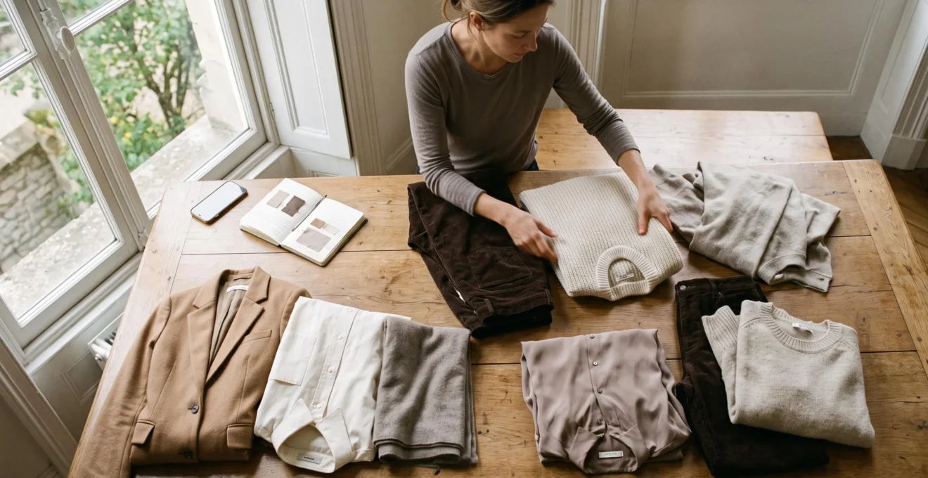
A neutral colour palette becomes interesting when its shades work together without looking identical. Cream, camel, chocolate brown, grey, navy and black can form the foundation of a polished wardrobe, but choosing several neutral colours is not enough. Their undertones, lightness and textures determine whether an outfit looks considered or visually flat.
The most reliable approach is to start with the clothes you already wear, identify two compatible base neutrals and introduce contrast through lighter and darker shades, fabric surfaces and carefully chosen accents. This creates outfits that coordinate naturally without requiring a large wardrobe or a new colour combination every morning.
For a minimalist or professional wardrobe, the objective is not to follow a rigid seasonal colour system. It is to establish a practical set of colours that suits your preferences, works in your everyday lighting and makes individual pieces easier to combine. Once those relationships are clear, buying clothes and getting dressed become simpler decisions.
The essentials of a polished neutral palette
- Choose two base neutrals that coordinate with the clothes you already wear, preferably with a clear difference in lightness.
- Build visual depth through contrasting textures, such as matte wool, smooth cotton and subtly lustrous silk.
- Test combinations in natural light and on your actual webcam before committing to a new shade or replacing existing clothes.
- Do Some Neutral Wardrobes Look Expensive While Others Look Plain?
- How to Choose 2 Base Neutrals That Match 90% of Your Wardrobe?
- Black Neutrals or Cream Neutrals: Which Works Better If You Commute Daily?
- The Neutral Palette Mistake That Makes Your Outfit Look “Muddy” in Daylight
- When Should You Switch Your Neutrals for Autumn Without Replacing Everything?
- Warm Neutrals or Cool Neutrals: Which Makes You Look Less Tired on Video Calls?
- How to Build a Personal Colour Palette From 12 Items You Already Own?
- How Do You Build a Colour Palette That Makes Getting Dressed Faster Every Morning?
Do Some Neutral Wardrobes Look Expensive While Others Look Plain?
Neutral wardrobes tend to look more polished when their colours, textures and proportions create visible definition. A combination of cream and chocolate brown has a clearer light-dark relationship than two nearly identical beige shades, while contrasting fabric surfaces add interest without introducing extra colours. The distinction is not the price of the garments: it is how their visual qualities work together.
A common problem is combining several mid-toned neutrals without establishing a clear relationship between them. Warm beige beside cool grey, for example, can look disconnected if both have similar lightness and the fabrics offer little textural contrast. These colours do not automatically clash, but their combination needs a deliberate visual anchor.
Adobe‘s guide to colour contrast explains how differences in brightness, colour temperature and texture can establish visual distinction. Applied to clothing, the principle suggests that an outfit does not need multiple colours to have depth. A lighter knit, a darker trouser and a textured outer layer can create a clear hierarchy within a restrained palette.
Texture is particularly useful when the colour range is narrow. The ASU FIDM Museum‘s article on texture in fashion illustrates how textile surfaces reflect light differently. A matte wool garment and a smooth silk blouse can therefore look distinct even when both are cream. This demonstrates a visual effect, not a guarantee that an outfit will look luxurious, but it offers a practical way to avoid uniformity.
A useful wardrobe diagnosis considers three elements together: undertone compatibility, variation in lightness and texture. Use the following grid to identify which element needs attention before buying anything new.
| Element | Signs of a cohesive palette | What to adjust |
|---|---|---|
| Undertones | The shades appear harmonious beside one another. | Re-pair uncertain warm, cool or neutral shades with a clearer anchor. |
| Lightness | At least one garment creates a noticeable light-dark distinction. | Introduce a lighter or darker piece rather than adding another similar mid-tone. |
| Texture | Fabric surfaces have visibly different finishes. | Combine a matte, smooth, brushed or subtly lustrous material. |
The practical goal is not to maximise contrast everywhere. It is to give the eye enough variation to distinguish the garments while keeping the overall outfit coherent. That principle makes choosing the right base colours the next logical step.
How to Choose 2 Base Neutrals That Match 90% of Your Wardrobe?
The most useful two base neutrals are the colours already repeated across your favourite trousers, knitwear, coats and shoes. Rather than assuming that one universal pair will coordinate with 90% of every wardrobe, audit the pieces you wear most and identify the two shades that naturally connect them. Your existing wardrobe provides a more reliable starting point than an aspirational shopping list.
Begin by taking out the ten garments you reach for most frequently. Look for recurring colours, including off-white, cream, black, navy, camel, grey, chocolate and taupe. Choose the two that appear most often and that can work together, rather than selecting two shades simply because they are popular neutral colours.
Next, compare their undertones in daylight. Warm neutrals may have yellow, golden or reddish qualities, while cool neutrals may have blue or distinctly cool grey qualities. Some shades sit closer to neutral and can bridge both families. The aim is not to ban every warm-cool combination, but to recognise when a pairing needs another element to connect it.
The second consideration is the difference in lightness. Cream and chocolate brown offer a more obvious contrast than beige and taupe of similar depth. That distinction helps a simple outfit feel intentional, even when it contains only two colours. If you prefer a darker wardrobe, black and a lighter grey or off-white can serve the same structural purpose.
Finally, check the colours against your face and your existing garments. Hold each shade near your face in natural light and observe whether you prefer its effect on your complexion. A pair that coordinates beautifully on a bed may still be less useful if one colour is rarely worn because you dislike how it looks near your face.
- Identify the two most repeated neutrals in your ten most-worn pieces.
- Check whether their undertones appear compatible in daylight.
- Confirm that they provide enough light-dark contrast for simple combinations.
- Test both colours near your face and alongside your regular shoes and outerwear.
- Wear each pairing before purchasing additional shades.
Keep the result flexible. If your wardrobe already combines black with warm beige successfully, there is no need to replace either colour to comply with a theoretical rule. The two-base method is a way to make decisions easier, not a requirement to eliminate every exception.
A strong base pair reduces the number of decisions required to create an outfit. It also makes practical questions easier to resolve, including whether black or cream should dominate the garments you wear during a daily commute.
Black Neutrals or Cream Neutrals: Which Works Better If You Commute Daily?
For a daily commute, black often makes more sense for coats, trousers, shoes and bags that regularly touch seats, floors or crowded transport surfaces. Cream is useful for knitwear, blouses and scarves that sit close to the face, where a lighter shade can soften an outfit. Neither colour is universally better: fabric, season, maintenance and where the garment is worn all influence the practical choice.
Black has an advantage when visible dirt and marks are a concern, but it is not maintenance-free. Lint, pale dust and some marks can stand out against a dark surface. Cream and off-white can make a wardrobe feel lighter, yet cuffs, hems and bag-contact areas may show grime more readily. Sweat marks also depend on fabric, fit and moisture, so colour alone cannot predict how a garment will perform.
Fabric construction changes the equation. A textured cream bouclé coat or tweed jacket may disguise minor surface wear differently from a fine cream knit. A smooth black fabric may be easy to brush clean, while another black material can attract visible lint. Consider the actual garment rather than assuming that every piece in the same colour behaves identically.
Lighting and temperature also matter. Dark and light garments can look different under office lighting, in outdoor daylight and in evening conditions. In warmer weather, the fabric’s weight, breathability and fit are usually more useful criteria for comfort than colour alone. In winter, a substantial wool coat may be practical in either shade if it suits the climate and care routine.
| Criterion | Black | Cream |
|---|---|---|
| Visible dirt | Can disguise some dark marks but reveal pale lint and dust. | Can reveal grime and stains, particularly at cuffs and hems. |
| Styling role | Useful for grounding outerwear, trousers, shoes and bags. | Useful for lightening knitwear, scarves and tops. |
| Fabric choice | Surface finish affects lint, marks and maintenance. | Texture can affect how noticeable everyday wear becomes. |
| Care requirements | Depend on fibre, construction and cleaning instructions. | Depend on fibre, construction and cleaning instructions. |
A hybrid wardrobe is often the most flexible option. Use darker neutrals for high-contact pieces and lighter neutrals where they are easier to maintain. Then check whether both shades work with your base pair, so practicality does not come at the expense of coordination.
The same practical thinking helps prevent another common problem: neutral outfits that appear harmonious indoors but lose definition in daylight.
The Neutral Palette Mistake That Makes Your Outfit Look “Muddy” in Daylight
A neutral outfit can look muddy when several similar mid-tones sit together without a clear visual anchor. Shades such as greige, mushroom, taupe and oat are not inherently difficult to wear, but their subtle differences may become hard to distinguish when the garments have similar lightness and texture. The solution is to establish a clearer relationship between the colours rather than removing every nuanced neutral from your wardrobe.
Indoor lighting can make two shades appear more compatible than they do in another environment. The National Institute of Standards and Technology explains in its explanation of how lighting affects colour perception that illumination influences the colours people see. Clothing can consequently appear different under shop lights, at home and outdoors. Individual perception also varies, so daylight is a useful comparison condition rather than an infallible aesthetic test.
To correct a muddy combination, start with a clear anchor. Pair a light cream with a distinctly darker brown, charcoal or black, then introduce a mid-tone as a secondary element. Alternatively, keep the outfit within a warm or cool family while varying lightness and fabric surface. A neutral shade that previously looked uncertain may work well once it is positioned between two more distinct colours.
Photograph the outfit near a window and, if possible, compare it against a plain white surface. This is a practical styling exercise, not a scientifically validated test. Ask whether the garments remain distinguishable and whether the overall combination looks balanced. If everything appears to merge into one indistinct mass, try changing one garment rather than replacing the entire palette.
- Keep mid-tones intentional: use taupe or greige as a supporting shade when several similar colours are difficult to distinguish.
- Create a visual anchor: introduce a clearly lighter or darker garment.
- Compare in more than one setting: inspect the combination indoors and in daylight.
- Change one variable at a time: adjust the colour, lightness or texture before deciding the entire outfit is wrong.
A clear palette does not need to remain visually identical throughout the year. Changes in daylight, layering and fabric weight can refresh the same neutrals for autumn without requiring a separate wardrobe.
When Should You Switch Your Neutrals for Autumn Without Replacing Everything?
Switch your neutral wardrobe for autumn when your daily outfits start requiring more layers and your lightweight fabrics no longer suit the conditions, not simply because a particular date has arrived. The most economical approach is to retain your core colours and change their textures, layering and contrast. A cream shirt can remain useful all year, while a brushed wool version creates a different seasonal impression.
Begin with materials. Lightweight poplin, linen and fine cotton often suit warmer conditions, while brushed wool, corduroy, substantial knits and heavier twills can give familiar colours a more autumnal feel. These are styling tendencies rather than fixed seasonal rules: fabric weight, comfort and the local climate should determine what you actually wear.
Next, change the layers and accessories before replacing core garments. A darker coat, textured scarf, leather shoes or a substantial knit can shift the overall impression of a familiar outfit. If cream and chocolate brown already work together, they do not need to be abandoned when the weather changes. Their proportions and surfaces can do the seasonal work.
Be careful not to darken every garment at once. An entirely mid-to-dark wardrobe can lose definition if the shades are too similar, especially when several heavy fabrics have comparable finishes. Preserve a range of lightness within the same palette. Cream, camel, chocolate and a suitable darker neutral can remain distinct while becoming more seasonally appropriate through layering.
The timing can be practical rather than calendar-based. Consider the change when outdoor conditions make lighter layers uncomfortable, when mornings and evenings call for outerwear, or when your current fabrics no longer work for your routine. The effect of daylight on perceived colour is another reason to inspect combinations in the conditions in which they will be worn, rather than assuming that seasonal colour rules apply universally.
For a gradual transition, make changes in this order:
- First: add or change scarves, shoes and other accessories.
- Second: introduce a suitable coat, jacket or heavier layering piece.
- Third: bring in textured knitwear and trousers that work with your existing basics.
- Finally: replace a core garment only if it no longer meets your practical needs or fits your established palette.
This approach keeps seasonal purchases focused. It also protects the consistency of your wardrobe because the most frequently worn colours remain the foundation rather than being replaced twice a year.
Seasonal dressing is only one part of the picture. The same palette also needs to work in the settings where you spend time, including video calls, where lighting and the relationship between your clothing and background can influence how you appear on screen.
What to remember before personalising your palette
- Build around the neutrals you already wear regularly instead of buying a new set of colours for each season.
- Judge colours in the lighting where you will use them, and account for the difference between mirror and camera appearance.
- Use a small, repeatable selection of base colours, layers and textures as the foundation for a personal palette.
Warm Neutrals or Cool Neutrals: Which Makes You Look Less Tired on Video Calls?
The neutral that makes you look less tired on video calls is the one that works with your complexion under your actual camera and lighting conditions. Warm cream, camel and soft brown may suit some people, while soft grey, grey-blue or off-white may work better for others. There is no universal rule that warm neutrals improve every face on camera; the most reliable method is to compare the options on your own screen.
Video appearance depends on several interacting factors, including room lighting, camera white balance, screen settings and the colour of nearby surfaces. A shade that looks balanced in a mirror can appear different in a webcam preview. Rather than assuming the camera always cools skin tones, test how it renders your face in the setup you use for meetings.
Start with two or three tops in different neutral families. Wear each one in the same room, with the same light source and camera position. Keep your hair, framing and background as consistent as possible, then compare the preview. Look at the overall balance of your complexion and the visibility of under-eye shadows without treating either as a precise measurement of colour suitability.
The background matters as well. A top that is nearly the same colour and lightness as the wall behind you may make the outline of your body less distinct. Zoom‘s virtual background recommendations advise against wearing clothing that matches the virtual background and emphasise suitable lighting. This is technical guidance for virtual-background performance, not evidence that one particular neutral flatters everyone.
Use a simple comparison rather than relying on memory. Take a screenshot of each test if appropriate, or switch between the garments while keeping the setup unchanged. If the camera’s automatic exposure or white balance changes between tests, repeat the comparison before drawing conclusions. The aim is to find a dependable result for your normal working environment, not to establish a universal colour rule.
- Choose two warm and two cool or neutral options to compare.
- Keep the camera position, lighting and background consistent.
- Check whether each top separates clearly from the background.
- Compare the overall appearance on screen rather than relying only on the mirror.
Once the palette works both in person and on screen, the next step is to make it personal. A small audit of clothes already in regular rotation can reveal which colours deserve to form the foundation of future purchases.
How to Build a Personal Colour Palette From 12 Items You Already Own?
The easiest way to build a personal colour palette is to start with twelve items you already wear frequently. Lay them out in natural light, group them by their apparent undertones and identify the colours that recur most naturally. Your most-used clothes are a better starting point than items bought for an imagined lifestyle, because they reflect what you actually like to wear.
Select a manageable mix of tops, trousers, knitwear, outer layers and, if useful, shoes or accessories. Choose pieces that feature in your weekly routine rather than filling the selection with special-occasion garments. Lay them together and look for recurring families: perhaps black, off-white and grey, or cream, camel and chocolate brown.
Then apply a wear-rate filter. Separate the pieces you reach for every week from those worn only once or twice a season. If a garment is rarely used despite being attractive on its own, ask whether its colour is difficult to coordinate with the rest of your wardrobe. The cause could be an undertone mismatch, insufficient contrast, an unsuitable texture or a practical issue unrelated to colour.
From the twelve items, identify two base neutrals and one optional accent. The accent might be muted olive, burgundy, navy or another colour that already appears in your most-worn pieces. It does not need to be a bright colour. Its purpose is to provide a controlled point of variation while remaining compatible with the base pair.
Do not discard a garment simply because it appears to sit outside the emerging palette. Try it with a clearer anchor or a different texture first. A warm taupe piece may work better beside cream and chocolate than next to a cool grey of similar lightness. Equally, a garment may be worth retaining for a specific purpose even if it does not belong in your everyday combinations.
Use the results to establish a purchasing filter. Before buying another top, pair of trousers or jacket, check it against both base neutrals and the accent, where relevant. This reduces the risk of accumulating attractive pieces that each require their own separate outfit.
Your five-step wardrobe palette audit
- Gather twelve frequently worn items and photograph them together in daylight; save the photograph as your baseline.
- Group the garments by apparent undertone and label the recurring families in your notes; this becomes your undertone inventory.
- Separate weekly favourites from rarely worn pieces and record the main reason for each rarely worn item; this creates a short list of possible coordination problems.
- Select two compatible base neutrals and one optional accent, then record the chosen colours and the garments that represent them.
- Test each remaining garment against the base pair and note whether the issue is undertone, lightness, texture or practicality; this creates a keep, re-pair or reconsider list before any new purchase.
The audit is complete when it produces decisions you can use, not when every item matches perfectly. A personal palette should describe your real wardrobe, allow a little variation and help you recognise which new garments will be useful.
The final step is to turn that palette into a repeatable dressing system. When the colours and textures are clear, individual outfits can follow a few familiar formulas instead of requiring a new decision every morning.
How Do You Build a Colour Palette That Makes Getting Dressed Faster Every Morning?
A colour palette makes getting dressed faster when it turns the wardrobe into a set of compatible choices. Two base neutrals, a supporting accent and a few distinct textures provide enough structure to combine clothes without starting from scratch each morning. The goal is not to make every garment interchangeable, but to reduce the number of combinations that require special thought.
Start with a simple outfit formula: one base piece, one layer and one textural or colour accent. For example, chocolate trousers, a cream knit and a textured camel coat create a restrained combination with clear differences in lightness and surface. Another formula might pair black trousers with a soft grey top and a dark structured jacket. These are starting points, not fixed rules; adjust them to your climate, workplace and personal style.
Create several variations around the same structure. Keep the base trousers and change the top, or keep the top and alternate between a cardigan and a jacket. When the colours already coordinate, the decision becomes which combination suits the day’s activities rather than whether every garment works together.
Organise the wardrobe so the palette is easy to see. Group the core neutrals together, then place layering pieces and accent items nearby. This can be more useful than arranging everything only by garment type, especially when you want to assemble a complete outfit quickly. The best arrangement is the one that makes your most-used combinations visible and accessible.
Protect the system when shopping. Before buying an exception piece, check whether it works with both base neutrals. If it matches neither, ask whether it has a clear role that justifies the additional coordination effort. An occasional statement item can be worthwhile, but repeated exceptions can make a supposedly simple wardrobe more complicated.
A practical starting routine is to prepare three outfit formulas using clothes already in your wardrobe. Photograph each combination and note any missing item that genuinely prevents you from wearing it. This is more actionable than purchasing a full capsule wardrobe at once, because it identifies the specific gaps in your existing system.
Start with your current favourites, choose two reliable base neutrals and establish a few repeatable combinations. As new garments enter the wardrobe, test them against that foundation before buying more. The result is a personal colour palette that supports effortless dressing without making your style feel uniform.
How many colours should a neutral wardrobe contain?
There is no required number. A practical starting point is two base neutrals, one optional accent and additional shades that coordinate with them. The important consideration is whether your most-used garments can be combined easily, not whether the wardrobe follows a particular colour count.
Can you mix warm and cool neutrals in the same outfit?
Yes. Warm and cool neutrals can work together when the combination has a clear visual relationship. Differences in lightness, texture or a bridging shade can help connect them. Test the actual garments in different lighting conditions because their appearance may change with illumination.
Which neutral colours are easiest to coordinate?
Black, cream, grey, navy, camel and brown are useful starting points, but the easiest pair depends on your existing clothes and preferences. Choose two shades already repeated in your wardrobe, then check that they work together and provide enough contrast for simple outfits.
How can you make a monochrome outfit more interesting?
Combine different textures and vary the lightness of the garments. A smooth cotton shirt, a brushed wool layer and darker trousers can create depth within one colour family. Accessories can introduce another surface or a small accent without requiring an entirely new colour palette.
Do you need to replace your wardrobe to create a cohesive palette?
No. Start by auditing twelve items you already wear, identifying two base neutrals and checking how the remaining garments combine with them. Re-pair pieces, change layers and use texture before replacing anything. Buy only when a genuine gap remains in your everyday combinations.