
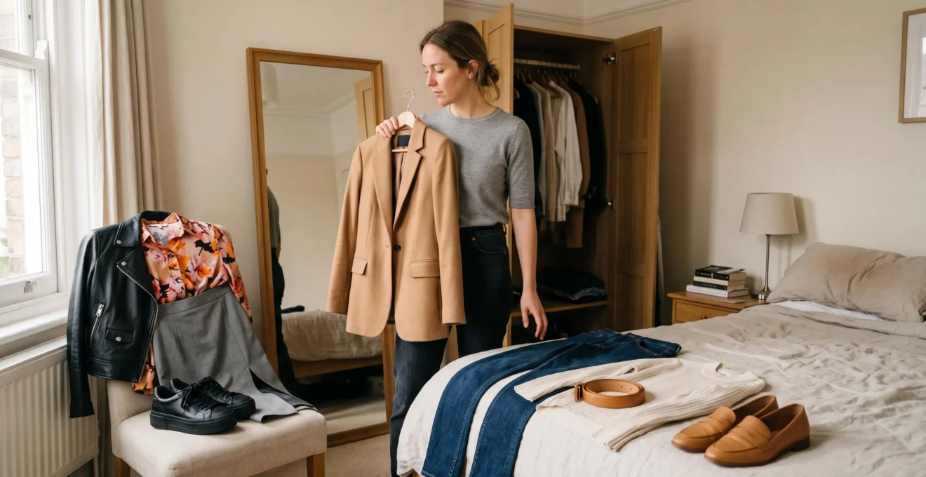
A white T-shirt, well-fitting trousers, and simple shoes can look remarkably polished on one person yet strangely disconnected on another. The difference is rarely the price of the clothes or the number of accessories. More often, it comes down to how the individual pieces relate to one another.
Visual harmony happens when proportion, repetition, and contrast give an outfit a recognizable structure. Colors echo each other, silhouettes feel balanced, and accessories support the overall direction rather than competing for attention. Even a deliberately unconventional outfit can feel cohesive when its contrasts have a clear purpose.
For anyone who can recreate the individual pieces of an inspirational outfit but struggles to capture its finished appearance, the solution is to understand the visual relationships behind it. A few practical checks can reveal whether the problem is color, fit, styling, or inconsistent formality.
The objective is not to make every outfit perfectly matched. It is to make the choices look connected, while leaving enough variation for personality and interest.
The essentials of a visually harmonious outfit
- Build relationships: Connect garments through at least one recognizable color, material, shape, or level of formality.
- Control proportions: Consider where garments end, how volume is distributed, and whether the silhouette has a clear structure.
- Use deliberate contrast: Introduce a noticeable difference while preserving a visual connection elsewhere.
- Why Do Some Simple Outfits Look Perfect While Yours Feels Random?
- How to Make an Outfit Look Intentional by Repeating 1 Detail 3 Times?
- Match Shoes to Top or Bag: Which Looks More Harmonious in Smart Casual?
- The Accessory Mistake That Breaks Visual Harmony in 30 Seconds
- When Should You Create Outfit Templates Instead of Styling From Scratch?
- How to Check Visual Coherence in 30 Seconds Before You Leave the House?
- How to Add Contrast Using Only 1 Variable So Your Outfit Still Looks Cohesive?
- How Do You Create Intentional Contrast Without Looking Like You Got Dressed in the Dark?
Why Do Some Simple Outfits Look Perfect While Yours Feels Random?
Simple outfits look harmonious when their components create recognizable relationships through color, proportion, texture, or formality. An outfit can contain only three pieces and still feel disconnected if none of them supports the others. Simplicity removes visual distractions, but it does not automatically create balance or make individual garments work together.
The distinction is between minimalism and coherence. Minimalism describes how little an outfit contains. Coherence describes how those elements interact. A cream sweater, charcoal tailored trousers, and dark loafers might feel connected through their restrained palette and comparable formality. Replacing the loafers with highly technical running shoes introduces a different visual direction, which may require another sporty element to feel deliberate.
According to Utah State University Extension‘s clothing design principles, balance, proportion, emphasis, and rhythm contribute to visual harmony in clothing. Repeating visual elements can establish continuity, while the size and placement of components affect the overall composition. These principles are guidelines, not objective measurements of good taste.
Proportion is a useful place to investigate when colors already coordinate. Imagine a long, loose sweater worn over wide trousers. The combination may obscure the waist and make the entire silhouette appear unstructured. A shorter sweater, a partial tuck, or a visible waistline can introduce definition without changing the colors.
The less obvious consideration is formality. A tailored blazer, athletic trainers, and delicate jewelry can work together as an intentional high-low combination. But without a connecting element, the pieces may appear to belong to different occasions. Their colors alone cannot explain the intended styling direction.
To identify the issue, take a photograph and temporarily view it in black and white. Look for a readable distribution of light, medium, and dark tones. If the values appear scattered, try repeating a tone or creating a clearer light-to-dark relationship. If the grayscale photograph looks balanced but the outfit still feels disconnected, examine the silhouette, fit, and dress-code signals.
This is a diagnostic technique rather than a definitive test: black-and-white photography removes color information, so it cannot detect every color mismatch.
Once the main source of disconnection is identified, repetition offers a straightforward way to establish a visible relationship without replacing the entire outfit.
How to Make an Outfit Look Intentional by Repeating 1 Detail 3 Times?
Choose one recognizable detail and repeat it in three separate places, such as a gold necklace, a gold belt buckle, and gold handbag hardware. This creates a visual thread across the outfit. Three repetitions are a practical styling exercise, not a scientifically established requirement: two coordinated elements can also create a convincing sense of intention.
Repetition works because the eye can recognize related elements as part of the same composition. In MIT‘s lecture on graphic design principles, repetition is presented as a means of creating unity, while contrast helps direct attention. Applying these ideas to clothing is a styling interpretation rather than a fashion-specific experimental finding.
There are three useful ways to introduce repetition:
- Color repetition: Echo burgundy between shoes, a scarf, and a subtle pattern in the top. This is often the most immediately noticeable approach.
- Material repetition: Connect a leather belt with leather footwear, or a ribbed knit top with another textured knitted accessory.
- Shape repetition: Echo the rounded structure of a bag with a rounded neckline, or connect pointed shoes with angular eyewear.
For beginners, selecting just one category makes the exercise easier to evaluate. Trying to repeat several colors, shapes, and materials simultaneously can make the result feel overly coordinated, particularly when every repetition is equally prominent.
Consider a hypothetical outfit built around straight-leg jeans, a cream shirt, and brown loafers. A brown belt and a handbag with brown trim create a repeated color relationship. The pieces do not need identical shapes or textures to make that connection visible.
Restraint matters. Three large, identical accents in a saturated color may create an emphatic matching effect that feels more theatrical than intended. For everyday styling, an appealing alternative is to vary the scale: one dominant repetition supported by two smaller echoes.
If the wardrobe is limited, two repetitions placed far apart can still work. Matching the color of shoes to earrings, for example, connects the lower and upper parts of a silhouette without requiring a third purchase.
Once a repeated detail is established, the next decision is where to position it. Shoes, bags, and tops create different visual relationships, especially in smart-casual dressing.
Match Shoes to Top or Bag: Which Looks More Harmonious in Smart Casual?
Matching shoes to a bag is a familiar way to give a smart-casual outfit a polished, coordinated appearance. Matching shoes to a top instead creates a color connection between the upper and lower parts of the silhouette. Neither strategy is universally superior: the better choice depends on the outfit’s proportions, color distribution, and desired effect.
Smart casual leaves room for interpretation. Tailored trousers can sit beside knitwear, denim can accompany a blazer, and loafers or clean sneakers may both be appropriate depending on the occasion. Because different dress codes can overlap, one deliberate visual echo helps clarify the direction.
The following comparison is a practical styling guide, not a tested ranking of what observers find most attractive.
| Styling criterion | Shoes matched to bag | Shoes matched to top |
|---|---|---|
| Visual relationship | Connects two accessories across the outfit | Repeats color between the upper and lower silhouette |
| Typical impression | Classic, structured, coordinated | Continuous, balanced, deliberately styled |
| Useful context | Office wear, polished separates, understated tailoring | Relaxed tailoring, layered outfits, stronger color distribution |
| Potential drawback | Can feel overly matched if every accessory is identical | May create competing blocks if the trousers dominate visually |
| Easy adjustment | Vary accessory texture or shape | Keep the middle garment relatively restrained |
For example, black loafers with a black structured bag can frame cream trousers and a grey sweater. Alternatively, dark brown loafers echoing a dark brown knit can create a relationship across light-colored trousers. Neither combination guarantees an elongated silhouette, but both can guide how the eye travels through the outfit.
There is also a third option: match neither the top nor the bag. Shoes can coordinate with a belt, while the bag hardware echoes a watch or earrings. Partial coordination allows more flexibility, especially when accessories are already owned in different colors.
Pay attention to near-matches. A cool, brilliant-white shoe beside a noticeably warm ivory bag may look accidentally inconsistent if the intention is exact matching. Rather than searching endlessly for an identical shade, consider a clearly intentional contrast or a broader tonal palette where the difference belongs.
Matching is therefore a tool, not an obligation. A cohesive outfit can use several related neutrals without containing a single exact color duplicate.
After footwear has established the outfit’s direction, accessory finishes deserve attention because small metallic details can either reinforce that direction or introduce another focal point.
The Accessory Mistake That Breaks Visual Harmony in 30 Seconds
An accessory mistake that can make an otherwise restrained outfit feel visually busy is introducing several prominent, unrelated focal points without a clear styling intention. Mixed metal finishes are one possible example, but mixing gold, silver, and rose gold is not inherently wrong. The issue is whether the accessories compete or form a recognizable composition.
Metal hardware tends to attract attention because it reflects light and often appears at noticeable points: the neckline, wrist, waist, and handbag. A silver watch, gold chain, and rose-gold buckle can establish several distinct accents. That combination may look intentional when the finishes share a visual relationship, but less coherent when each has a different scale and styling direction.
The title’s 30-second framing describes a quick personal styling check, not a measured threshold for how fast viewers identify mismatches.
A beginner-friendly solution is to choose a dominant metal finish. For example, a gold necklace, gold belt buckle, and subtle gold handbag clasp create a consistent thread. Other accessories can remain neutral or understated.
However, Vogue‘s advice on layering jewelry explicitly treats mixed metals as a legitimate styling choice. Its editorial guidance emphasizes balancing statement pieces rather than requiring identical finishes everywhere. This supports a more flexible approach than an absolute prohibition against mixing metals.
Someone who owns both silver and gold accessories has several workable choices:
- Use predominantly silver or gold hardware for a deliberately uniform appearance.
- Choose one two-tone watch or accessory that visually connects different finishes.
- Repeat both metals in a controlled way, rather than leaving each as an isolated accent.
- Allow one prominent piece to lead while keeping other jewelry quieter.
Warm-toned clothing in camel, rust, or olive can look attractive with either warm or cool metals. There is no reliable basis here for claiming these palettes are inherently less tolerant of mixed finishes. What matters is how conspicuous the contrast appears within the particular outfit.
A practical experiment is to remove one accessory and look again. If the outfit immediately feels calmer, that item was probably competing with the intended focal point. If the look loses character, the contrasting metal may have been doing useful work.
Repeatedly making these small decisions can become tiring. A reusable outfit structure can preserve visual coherence without requiring a new composition every morning.
When Should You Create Outfit Templates Instead of Styling From Scratch?
Create outfit templates when getting dressed repeatedly involves unnecessary decisions, when wardrobe pieces rarely seem to work together, or when a consistent appearance matters for regular activities. A template establishes a repeatable relationship between garment shapes, formality, and accessories while allowing different pieces to occupy each position. It is more flexible than wearing the same complete outfit every day.
An outfit template is a structural formula rather than a saved photograph. For example, fitted top + wider trousers + structured shoes + one repeated accessory detail defines a silhouette and a coordination method, without requiring particular brands or colors.
Three hypothetical formulas illustrate the principle:
- Relaxed smart casual: Fine-knit top + straight trousers + loafers + one accessory echo.
- Balanced weekend wear: Relaxed shirt + fitted jeans + simple sneakers + repeated neutral color.
- Modern tailored look: Structured blazer + streamlined base layer + wide-leg trousers + understated jewelry.
Templates are especially useful when work mornings are rushed, the same dress code recurs, or several garments look appealing individually but rarely work together. They reduce the number of decisions without eliminating personal expression.
They can also become a shopping filter. Before buying another oversized jacket, ask whether it fits an existing silhouette formula and which trousers or shoes would support its volume. This is a practical way to distinguish a useful addition from an attractive item that has no obvious place in the wardrobe.
Templates do have limits. Following the same formula without considering weather, fabric weight, fit, or occasion can produce outfits that feel monotonous or unsuitable. A winter formula based on heavy knitwear, for example, needs a different interpretation in warm weather.
Refresh one variable occasionally: replace smooth leather footwear with suede, change a shirt’s texture, or exchange structured accessories for softer shapes. The underlying relationships remain while the visual result changes.
Free styling still has value. Events, experimental dressing, and creative occasions can justify time spent exploring unexpected combinations. Templates should make everyday dressing easier, not restrict what can be worn.
A template provides the starting structure, but a brief final inspection remains useful because fit, accessories, and unexpected color relationships change with every combination.
How to Check Visual Coherence in 30 Seconds Before You Leave the House?
Use a quick mirror check to identify one connection, assess accessory finishes, compare formality levels, and inspect the silhouette. Start with the most noticeable inconsistency rather than evaluating every possible styling rule. If something feels disconnected, replacing one item or adjusting how a garment sits will often be more practical than rebuilding the outfit.
The following four-point check is a heuristic for everyday dressing, not an experimentally validated assessment. Each step should take only a few seconds once the routine becomes familiar.
- Find a visual echo. Squint and look for a color, texture, or shape appearing at least twice. If nothing connects, consider coordinating shoes with a belt or accessories with the top.
- Inspect accessory finishes. Check whether hardware reinforces a common direction or forms an intentional mixed-metal combination.
- Compare formality. Ask whether the shoes and outerwear appear suitable for the same general occasion. Deliberate high-low styling is acceptable, but it should look purposeful.
- Check proportions. Look at where waistlines and hems fall. If several loose elements conceal the silhouette, try defining one area through fit, tucking, or garment length.
When time is particularly limited, an effective starting order is formality, then proportion, then color repetition. This is a practical prioritization, not a universal hierarchy: an extremely conspicuous color clash may deserve attention first.
The next step is the distance-photo test. Position a phone roughly two meters away, take a full-length photograph, and view it at a small size. Compared with examining fabric details up close, the reduced image can make the main silhouette and large tonal areas easier to assess.
This technique cannot reproduce how everyone else sees an outfit, and photographs can distort proportions through camera height, lens, and lighting. Its value is simply to provide a different perspective from the full-length mirror.
Build a repeatable outfit-check routine
- Identify one repeated color or texture and name the two garments that carry it. Record the connecting detail in a short note.
- Inspect the shoe and outerwear formality levels. Identify any intentional dress-code contrast or make one specific swap.
- Check waistline, hem lengths, and volume distribution. Choose one adjustment and take a second mirror look.
- Take a full-length photograph from approximately two meters and inspect the image at thumbnail size. Save the version with the clearest silhouette.
- After wearing the outfit, note whether it felt comfortable, practical, and visually satisfying. Save one useful observation beside the photograph.
Over time, this produces a small personal reference library. Outfits that felt good throughout the day are particularly informative, because visual cohesion should work alongside comfort and practicality. Compliments can provide additional feedback, but they are not a necessary measure of success.
Once a basic outfit passes the check, contrast can make it more interesting. The challenge is introducing differences without losing the relationships that hold the outfit together.
How to Add Contrast Using Only 1 Variable So Your Outfit Still Looks Cohesive?
Choose one main dimension of contrast, such as color value, texture, or silhouette, and keep the remaining elements relatively consistent. A chunky knit with a smooth leather skirt can create texture contrast inside a restrained palette. This one-variable approach makes differences easy to understand, although successful outfits can also combine several contrasts when their relationships remain clear.
Contrast introduces interest by making an element stand out against its surroundings. Repetition and similarity provide the counterweight that keeps the composition connected.
For beginners, concentrating on one main difference is useful because it becomes easier to identify which garment provides the focal point and which elements support it.
Three hypothetical combinations demonstrate distinct forms of controlled contrast:
- Tonal contrast: A cream sweater with charcoal trousers in fabrics of comparable texture and visual weight. The main difference is light versus dark.
- Texture contrast: A chunky knitted sweater with a smooth leather skirt in related neutral tones. The change in surface texture supplies the interest.
- Silhouette contrast: A fitted top with wide-leg trousers. Color remains restrained while volume becomes the dominant distinction.
These examples simplify the possibilities rather than isolating every variable perfectly. Real garments also differ in drape, sheen, structure, and perceived formality.
Monochromatic outfits illustrate why texture matters. If a look contains several garments of almost identical color, introducing ribbed knitwear, brushed wool, or smooth leather can provide dimension without relying on another color. Similar fabrics can also look sophisticated when proportion and detail establish enough distinction.
A second consideration is the strength of the contrast. Two nearly identical colors may appear accidentally mismatched if the intention is a clear tonal difference. Likewise, two subtly different knits may not provide the pronounced texture variation someone expected.
When contrast is meant to be noticeable, make the difference legible. Cream against charcoal creates a clearer value distinction than two close charcoal shades. Chunky ribbing beside smooth leather produces a more apparent textural change than two closely related knit finishes.
This is not a requirement to exaggerate every difference. Quiet tonal dressing can be equally intentional when small transitions are repeated consistently across the outfit.
The wider styling principle is balance: a strong contrast becomes easier to integrate when something else in the outfit creates continuity.
Key takeaways before experimenting with bolder contrast
- Choose the element that should attract attention first, rather than allowing several garments to compete unintentionally.
- Give an unusual pairing at least one recognizable connection through color, silhouette, texture, or accessory detail.
- Assess the entire outfit from a distance before deciding whether an unexpected combination works.
How Do You Create Intentional Contrast Without Looking Like You Got Dressed in the Dark?
Intentional contrast combines a noticeable difference with a recognizable connection elsewhere in the outfit. You might pair a vivid top with neutral trousers and repeat a small part of its color in an accessory, or mix contrasting textures within a consistent palette. The aim is not to eliminate unexpected combinations, but to make their visual relationship understandable.
A useful distinction is between contrast that has a purpose and contrasts that appear unrelated. A tailored blazer with casual denim can be deliberate when the fit, shoes, and accessories support the high-low direction. Add several competing colors, textures, and statement accessories without any relationship, and the composition may become harder to read.
However, counting contrasts is only a learning technique. Two or more strong differences do not automatically make an outfit incoherent. Fashion regularly uses multiple contrasts successfully, especially when there is a recognizable theme, color system, or repeated shape.
One practical styling heuristic is the counterweight principle: support a prominent contrast with something visually consistent elsewhere.
Consider three hypothetical examples:
- A bright cobalt sweater with orange shoes can become more controlled when the trousers, coat, and bag share a restrained neutral palette.
- A leather skirt worn with a chunky wool sweater can retain coherence through related colors and accessories of similar formality.
- An oversized blazer over a slim dress can produce strong volume contrast while the shoes and handbag reinforce the outfit’s overall dress direction.
The stabilizing element need not always be a repeated color. It might be a consistent degree of tailoring, a related material finish, or an accessory shape that echoes another part of the outfit.
For someone hesitant to experiment, start with a low-commitment contrast. Wear an otherwise neutral outfit and introduce a different shoe color, patterned bag, or contrasting belt. Observe whether the new element looks like the intended focal point or competes with existing details.
Once that feels comfortable, experiment closer to the face with a colored scarf, statement neckline, or distinctive earrings. These areas can be especially noticeable because they frame the face, so their impact may feel stronger than a contrasting accessory near the feet.
A final test is to describe the outfit in one natural sentence:
“The gold hardware connects the accessories, while the knit and leather create the main texture contrast.”
If no connection can be named, look for a small adjustment. If several connections and contrasts are present, that is not necessarily a failure; the sentence is a diagnostic aid rather than a strict grammatical rule.
The best results also respect the person wearing the clothes. An outfit can be unconventional, asymmetrical, highly colorful, or intentionally maximalist and still express a coherent visual idea. Harmony does not require uniformity.
For the next outfit, choose one visual relationship to preserve and one element to change. Photograph the result, make a single adjustment if necessary, and pay attention to how it feels throughout the day. That simple practice gradually turns deliberate styling choices into personal intuition.
Can an outfit look harmonious without matching colors?
Yes. Visual coherence can come from complementary proportions, repeated shapes, related textures, or consistent formality. A colorful outfit may have no exact color matches but still feel balanced because the silhouette and overall styling direction are recognizable. Exact matching is only one way to create continuity.
How many colors should a cohesive outfit contain?
There is no universally correct number. A limited palette can simplify coordination, but an outfit with several colors can also look intentional. A practical starting approach is to select a dominant color family, add supporting neutrals, and use any stronger accent deliberately. Consider where colors appear and how they relate, rather than treating a numerical limit as a fashion rule.
Does mixing casual and formal clothing always look wrong?
No. Mixing tailoring with casual pieces is a familiar styling approach. A structured blazer with denim or sneakers can look purposeful when fit, color, and accessories support the combination. If the outfit feels disconnected, identify which piece introduces the strongest formality change and decide whether to reinforce or soften that contrast.
Can different shades of the same color work together?
Yes. Tonal dressing intentionally combines lighter, darker, warmer, or cooler variations of a color. The result can be cohesive when those differences form a recognizable progression or are supported by consistent textures and proportions. Near-identical shades are not automatically mistakes; what matters is whether their relationship looks appropriate within the entire outfit.
What should you change first when an outfit feels unfinished?
Identify the most noticeable source of disconnection. If the shoes look unsuitable for the occasion, reconsider footwear. If the silhouette feels unbalanced, adjust volume or garment length. If the pieces look unrelated despite appropriate proportions, introduce a small repeated detail. A targeted change is usually easier to evaluate than changing several elements simultaneously.